Jump to content

Introducing the New 17th Shard Logos!


Chaos
 Share

Hello everyone! We have some pretty exciting news for you today: we are going to change the logos across 17th Shard, the Coppermind, and Arcanum! These new logos are made by Raul Chaves, who we hired based off a brand identity for Allomancy that he did. We've wanted to make our logos more modern for quite a while, and I hope you'll agree that they turned out awesome:

Patreon Main Logos.png

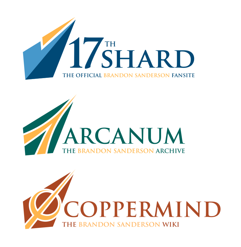
We have had the same logo for 17th Shard since 2016, the iconic glass shard with the 17 broken into pieces over it, and that 2016 logo wasn't very different from our original 2010 design. Both were made by Will Raboin (Shivertongue on the forums, but he's been out of the fandom for some time), and I have always been fond of them. 

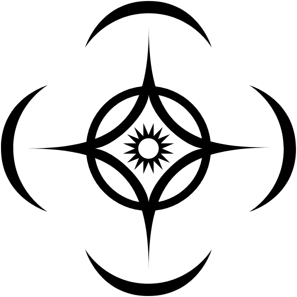
But, we wanted to make the 17th Shard logo flatter and more modern. We also wanted a simpler silhouette, which has a few advantages, in particular, future merchandise possibilities. The old look was quite poor for merch as it did not work well in monochrome, and required a pretty specific color scheme to be visible. You couldn't exactly put the old logo on a dark background! Also, the wordmark (that is, the text on the logo) was a bit too complicated, with a gradient on the word "Shard." We still wanted to try and evoke some of the same feel of the old logo though, with a similar shape that also evokes a bit of shattering.

old_old_17S.jpg    old_17S.png    17thShard - MAIN LOGO.png

Another benefit to this logo refresh was that it allowed us to start the process of unifying the design of 17th Shard, the Coppermind Wiki, and Arcanum, so that all our three sites feel more cohesive together. Now we have the common silhouette on all sites, with the same accent gold color.

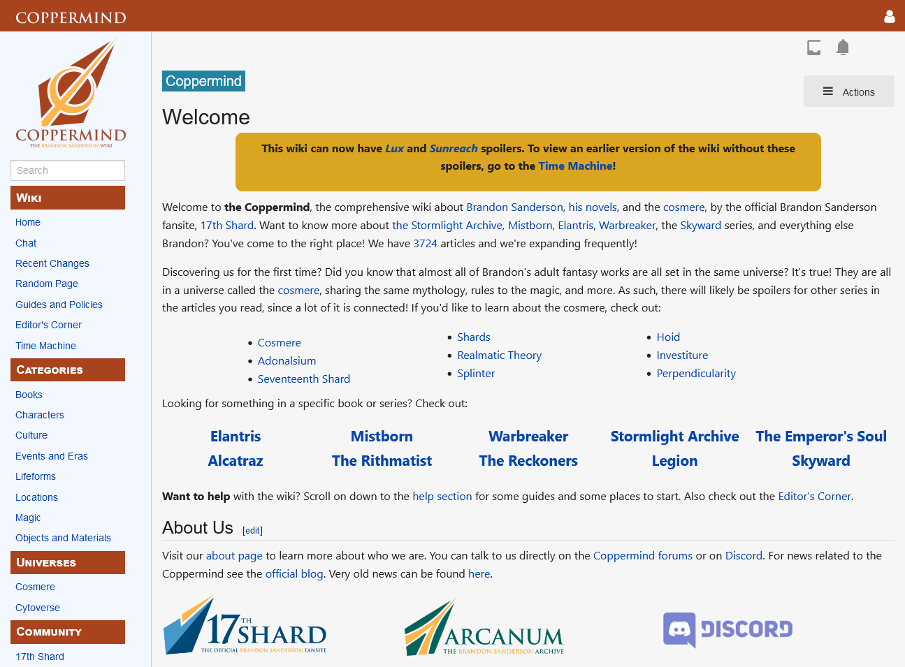
The Coppermind logo was... very old, and actually based off of the 2010 17th Shard logo, which had a green glowing gradient around the broken glass. Yikes, that was old. It's a huge improvement to get this updated, since realistically, even in 2010, we didn't love the Coppermind logo. We wanted to evoke a symbol from the Steel Alphabet, but also not use that icon directly.

old_coppermind.png    Coppermind - MAIN LOGO.png

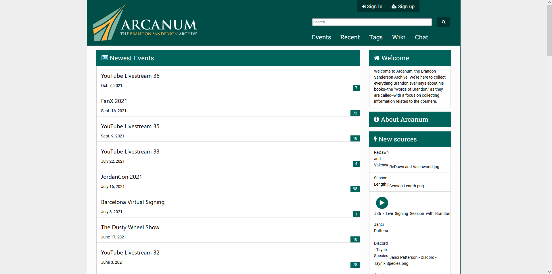
Arcanum's logo is the most recent of our three logos, coming out in 2017. This logo is my favorite of our three, and actually inspired the designs. The old logo was made by KChan--another retired staff member who was on some earlier Shardcasts, and who helped with a lot of colors on 17th Shard--who had the great idea of putting an A inside the cosmere logo. I love the Arcanum logo, but there are some problems with doing that. The cosmere symbol isn't easily scalable to a small icon, and also, having the art directly from the books in the logos would lead to issues in future merchandise. We still wanted to keep that A symbol very visible, as that's the defining feature of the current logo.

cosmere symbol.png    old_arcanum.png    Arcanum - MAIN LOGO.png

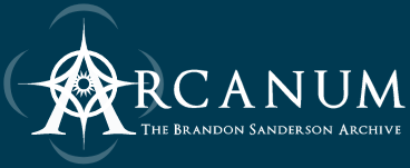
One other advantage to a flatter design is that it allows us to adapt the logo to fit with various background schemes, such as a dark colored shirt vs. a light colored shirt, or an eventual "dark mode" on our websites. In particular, Arcanum will still have a solid dark color in its header, but you can still immediately recognize this as the Arcanum logo:

Arcanum - MAIN LOGO for Arcanum on website banner green.png

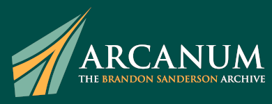
We will be updating our logos on these sites, as well as our social media icons and Discord server icons, within the next week or so. Arcanum, in particular, will be refreshed with a green aesthetic over its current blue, as 17th Shard will have a blue theme and we want each color scheme to be distinct. Here are some screenshots of how they might look on the sites themselves (but know these are subject to change):

17th Shard Mockup.png

Coppermind Mockup.png

Arcanum Mockup.png

Let us know what you think in the comments! Having our three main websites use a similar design language will really help tie them together, but the logos are just one part of that process. You can expect as things move forward that 17th Shard, the Coppermind, and Arcanum will start to have their overall designs change as well so things feel cohesive, but that's going to be a while away. Another long-term goal is to have some merchandise to sell eventually. But, in the meantime, we loved how these logos turned out so much that we want to unveil them now, and bigger redesigns will come much later.

Thank you to Raul for some truly fantastic work! Every penny spent on this was well worth it.

Edited by Chaos

 Share


User Feedback

Recommended Comments


Oh I like these! Clearly a lot of thought went into them, and yet it didn't compromise the "feel" of the logos. I like the distinct colour schemes for the different sites. 

When the websites get updated, will there be any time/energy devoted to adding more alt text and image descriptions?

Share this comment


Link to comment
Share on other sites

I like the logos! Losing the Coppermind and Arcanum logos will be bittersweet, but an ending can also be a beginning. 

Share this comment


Link to comment
Share on other sites

  1. I work in branding/marketing and graphic design, and personally, I love the new looks for the logos. Cohesion among the 3 of them will allow people in the fandom to recognize that the 3 websites are run together!
    • I didn't know that you guys also ran the Coppermind, somehow, until this year.
    • It's particularly smart to give new, dedicated logos to the Arcanum and Coppermind. No direct visual reference to the cosmere = no problems with copyrite laws! 
    • The flat styles are also just visually satisfying + modern. Great choices!
       
  2. I happened to finish the Shardcast episode today where you guys were discussing the Part 2 Epigraphs in Rhythm of War, and your excitement had me CACKLING!
    • Y'all are ballers.
    • I spend so many hours a week listening to your voices in traffic (I drive a lot from NJ to NY). Thanks for being the best! 

Share this comment


Link to comment
Share on other sites

36 minutes ago, cosmere_play said:

When the websites get updated, will there be any time/energy devoted to adding more alt text and image descriptions?

This is something I personally know very little about, but it's been lowkey on my radar of things I think we could be doing better. It's not something we specifically are planning to do, but I agree that we should, and it's mostly a matter of doing it well (and wrangling the sites' software suites into cooperating).

So if this is something you know something about, I would value your thoughts, and any resources that might be useful to us in the future.

Share this comment


Link to comment
Share on other sites

I like the Coppermind and Arcanum logos. But I'm not liking the new Shard logo as much, I feel it's a bit too different from the old one.

Share this comment


Link to comment
Share on other sites

The Shard logo looks a bit clunky on the site itself, but I do like the look of it and the other two are fantastic. I imagine that fixing the look of the whole site is a work in progress, so I'm not to worried about it. Great job!

Share this comment


Link to comment
Share on other sites

22 minutes ago, Matrim's Dice said:

The Shard logo looks a bit clunky on the site itself, but I do like the look of it and the other two are fantastic. I imagine that fixing the look of the whole site is a work in progress, so I'm not to worried about it. Great job!

Yeah, using it on the current site design is just a temporary-ish necessity. We didnt want to hold up the logos for a year while we try to get our act together on a forum redesign. :lol:

Share this comment


Link to comment
Share on other sites

The new Coppermind logo is great! The Arcanum logo I suppose had to change, given that it was the Cosmere logo, it's good too but the Cosmere logo is, well, the Cosmere logo and so pretty hard to beat. I'll miss the old Shard logo though. 

Share this comment


Link to comment
Share on other sites

Have to say the new 17th Shard logo is my least favorite with the new Arcanum logo being nice.

My reactions were:

(17th Shard logo) Hm, nice.

(Coppermind Logo) Snazzy.

(Arcanum Logo) Very snazzy.

Share this comment


Link to comment
Share on other sites

3 hours ago, Matrim's Dice said:

The Shard logo looks a bit clunky on the site itself, but I do like the look of it and the other two are fantastic. I imagine that fixing the look of the whole site is a work in progress, so I'm not to worried about it. Great job!

That's interesting! I personally like it significantly better than the current logo on the main site.

Share this comment


Link to comment
Share on other sites

Why do they all look like spearheads? They look great but just curious about the decision to have them be that way. 

Share this comment


Link to comment
Share on other sites

14 minutes ago, Chaos said:

That's interesting! I personally like it significantly better than the current logo on the main site.

Maybe it’s just the phenomenon of being used to something :P Though you’ve seen the current logo far longer than I have. I’m sure it’ll settle into my brain once it switches.

Share this comment


Link to comment
Share on other sites

Cool! I like the rare fanart including 17th Shard logos, but these will be much easier to recreate with my limited graphic design skills lol, and the updated site looks fresh :D

btw this talk of alt text has me excited, and most of the work is probably just promoting it! :D People usually just forget and leave it blank, so having a reminder with images wouldn't hurt... and the Coppermind could just link to Wikipedia's guide. Unlike Gallery images, Forum posts don't seem to have an option for captions or alt text, but maybe it would work to just add text beneath them >_>... This could be a thread on its own, so I started a thread!
Like I don't use a screen reader, but it seems the infrastructure is mostly just lacking on mobile, where the link icons for news, search, and other just says "link" with no description. I'm not sure what @cosmere_play is referring it, but the update seems alright as long as the update doesn't remove <alt="17th Shard The official Brandon Sanderson Fansite">! It would probably be best to hire a blind person to look at it either way ¯\_ (ツ)_/¯

Share this comment


Link to comment
Share on other sites

I love the new arcanum and coppemind logos, but I'm not sure how I feel about the new shard one....

Looking at it some more, I think I've found what seems off to me about it. I think I like the general shape/color change, but having the "17" next to the shard rather than on top of it is seeming weird to me. 

eh, I'm sure I'll get used to it.

iirc the shard logo is the default pfp for new accounts right? Is that going to be updated too? If it was up to me I wouldn't change it, I think the old logo works better as a pfp, and then there'd still be little bits of the old logo around the site.

Share this comment


Link to comment
Share on other sites

44 minutes ago, DougTheRug said:

Why do they all look like spearheads? They look great but just curious about the decision to have them be that way. 

Mostly to evoke the feel of the shape of the broken piece of class currently in the Shard logo.

20 minutes ago, Danex said:

I love the new arcanum and coppemind logos, but I'm not sure how I feel about the new shard one....

Looking at it some more, I think I've found what seems off to me about it. I think I like the general shape/color change, but having the "17" next to the shard rather than on top of it is seeming weird to me. 

eh, I'm sure I'll get used to it.

iirc the shard logo is the default pfp for new accounts right? Is that going to be updated too? If it was up to me I wouldn't change it, I think the old logo works better as a pfp, and then there'd still be little bits of the old logo around the site.

Yeah, it is definitely a change. Yes, the default profile picture will change. Feel free to download the old image and use it as your pfp if you want I guess.

Regarding alt text: I hope updated versions of Invision Power Suite allow for more alt text in things. This is definitely something we can do better, but we are also bound by the overall software suite. We will take care to make sure our customizations work for this; I was not thinking of this in 2016 unfortunately. 

Share this comment


Link to comment
Share on other sites

22 hours ago, Argent said:

This is something I personally know very little about, but it's been lowkey on my radar of things I think we could be doing better. It's not something we specifically are planning to do, but I agree that we should, and it's mostly a matter of doing it well (and wrangling the sites' software suites into cooperating).

So if this is something you know something about, I would value your thoughts, and any resources that might be useful to us in the future.

I don't know that there is any quality, free software that will help you achieve good alt text. :/

(Side note: Good alt text is genuinely something I would prioritize over having just any alt text!! While alt text is great for SEO, its primary implementation should be for accessibility. If the alt text is bad, you may be making your site less accessible for those with visual impairments, who could be using screen reader tools.)

In an ideal world, with unlimited resources at your disposal, I would suggest that you have a human being go through every single image >after &/or alongside any software that you might use for alt text. 

...If this sounds unfeasible (like it did for our company!), you could consider outsourcing the job to a marketing/SEO team. If that also doesn't sound feasible, maybe you could wrangle a bunch of us Shardies to help — similar to NaCoWriMo. It's a much easier job when there's a team working on this, if you're going to go the manual route. (You'll want to break down exactly what kinds of images take precedent, and create a process for how you'd track it and get it all done.)

Final note:
When trying to add alt text for the company I work for, I have this Hubspot page bookmarked for best practices

Edited by sugjesstive
fixed the weird strikethrough text

Share this comment


Link to comment
Share on other sites

Heh, having a marketing/SEO team (or any kind of team really), or hiring even a single person is probably going to be out of the picture for years to come, at best. We try to present ourselves professionally, but we are, at the end of the day, just a bunch of volunteers.

Tapping the community for some kind of organized effort might be a good idea though. We'd have to understand a little better what kind of needs visually impaired people have, and how to best aid them with alt text (because I wouldn't even know where to start - though that Hubspot page does look like a good resource). So we'll keep this in mind :)

Share this comment


Link to comment
Share on other sites

3 hours ago, PandACT said:

Unlike Gallery images, Forum posts don't seem to have an option for captions or alt text

If you double-click/double-tap an image when editing, you can set alt-text via the Image Title field. It's not super obvious that that's a thing you can do, though. (I myself only discovered it recently, though I tried to make use of it in yesterday's roundup article once I realized it could be done.)

Share this comment


Link to comment
Share on other sites

I am one of those people who will always have a knee-jerk 'no!' reaction to anything anywhere changing, because my soul is a dinosaur and doesn't like layout changes (except MS Word, but the last version I had was 2007's...), but I could probably get used to this.  I'll probably always like the logo I joined with the most, though.

I'm liking the Coppermind one.  The warm tones look really good.

Share this comment


Link to comment
Share on other sites

They look fantastic! I'm actually surprised how much I like them because it's also hard for me to get used to new layouts on sites that I visit often.

The only thing I'm a bit skeptical about is the new color scheme for the Arcanum. The traditional dark blue + white combination is much easier on the eye, in my opinion.

Great job altogether though!

Share this comment


Link to comment
Share on other sites

On 11/4/2021 at 1:05 PM, Argent said:

This is something I personally know very little about, but it's been lowkey on my radar of things I think we could be doing better. It's not something we specifically are planning to do, but I agree that we should, and it's mostly a matter of doing it well (and wrangling the sites' software suites into cooperating).

So if this is something you know something about, I would value your thoughts, and any resources that might be useful to us in the future.

My expertise only lies in the experience of writing image descriptions. I've been working on a project with Truthwatcher_Vez to write image descriptions for Shallan's sketchbook on ao3. I also did image descriptions for some of rspixart's art. 

Share this comment


Link to comment
Share on other sites

I can see that the Arcanum logo looks like an 'A' and the Coppermind logo represents an allomantic metal, but what is the 17th Shard logo supposed to resemble?

Edited by Argent
removed an empty spoiler box

Share this comment


Link to comment
Share on other sites

5 hours ago, FragrantSun said:

I can see that the Arcanum logo looks like an 'A' and the Coppermind logo represents an allomantic metal, but what is the 17th Shard logo supposed to resemble?

It's more subtle, just generally evoking both the old logo's shape, and the idea of something being broken off.

Share this comment


Link to comment
Share on other sites


Join the conversation

You can post now and register later. If you have an account, sign in now to post with your account.

Guest
Add a comment...

×   Pasted as rich text.   Paste as plain text instead

  Only 75 emoji are allowed.

×   Your link has been automatically embedded.   Display as a link instead

×   Your previous content has been restored.   Clear editor

×   You cannot paste images directly. Upload or insert images from URL.

Loading...

×
×
  • Create New...