

Nyali
-
Posts
849 -
Joined
-
Last visited
-
Days Won
1
Content Type
Profiles
News
Forums
Blogs
Gallery
Events
Everything posted by Nyali
-
A little off topic, but there's a WoB where Brandon said that Adolin's actions at the end of WoR would be perfectly acceptable to one of the KR Orders, just not the Skybreakers. I suspect he means the Dustbringers/Releasers, but we don't know much about that Order yet.
-
While I understand where you're coming from and I'm not trying to minimize your feelings on the subject, I feel that's a separate discussion, as the actual names haven't changed from what was in use before. I believe a discussion of changing specific names should be taken to another thread, possibly this one or this one. I'm trying to keep my comments in this thread to being about changes between the old UI and the new UI, and how the new UI could be tweaked. If numbers of some sort were put back in to give context, the interface becomes essentially the same as it used to be in that regard, and any further issues with it, I feel, should be discussed separate from this topic.
-
In an earlier post, I had suggested either putting the number back in or moving the ranks to the profile only, but I hadn't suggested renaming things or removing the system entirely. Now, I've suggested a rename, but not one that changes the actual names, just adds a number before them. Since we already have the + (and presumably a - for negative ranks), I personally wouldn't find it clunk to have a rank number follow. So, instead of appearing as "+ Gyorn" it would be "+ 25 - Gyorn" - alternatively, it might also look good to do it as "+ 25 Gyorn" without the "-", or to do "+ 25: Gyorn" or whatnot, the "-" was just one way to do it. Oh, and obviously, since we already have the +/- sign, there's no need to add a sign to the negative ones. So, Negaspren would just be "1: Negaspren" or whatnot, and would appear as "- 1: Negaspren" or whatever, whereas "1: Darkeyes" would appear as "+ 1: Darkeyes" or whatnot.
-
To be clear, in case I wasn't (which seems to be the case?), I wasn't saying that any of those titles offended me, but that I have negative associations with some of those titles. There was a question about which titles people considered negative, so I listed some, and concluded that they really aren't that bad/offensive. The only one that really bothers me personally is being called a "silent gatherer," but that's a personal thing, due to issues with harmful malpractice/negligence/discrimination from medical professionals in real life. Though, I also didn't appreciate being force-associated with militant religious extremists shortly after a religious extremist committed the largest mass shooting in US history, specifically targeting a minority I happen to belong to. That wasn't terribly comfortable, even if it's a fictional group and the association was weak. I felt that way before the change too though, but it didn't bug me until after the change with the context removed (I kinda ignored the titles before, just reading the number). I cared less a couple days later, but I wasn't personally affected by the tragedy (my cousin who lives just a mile away from the club was working at the time, and none of her LGBT friends happened to be at the club then either). I still feel that titles like these should either be clearly not user-chosen (by having the rep number or a numeric rep rank associated with them), or they should not appear on every post you make. I'd like to suggest, if you don't want to include the exact numbers, you number the ranks from 0 to N, so instead of it showing up as like "Bridgeman," it was "4 - Bridgeman" for being the fourth rank. That gives no more information than the rank itself gives, it just precludes having to check a lookup table like the one linked. It also gives just as much information to a new visitor than it does to someone who's memorized the system, rather than requiring new visitors to guess where each rank stands relative to one another. So, like, replace the rank names with the rank number followed by the rank name, like this (hidden because long): EDIT: Oh, and if you did use that system, if you remove one rank, the top rank (God Beyond) becomes rank number 100, which is nice and clean. The rank "so l33t hoid can't compete" doesn't really make sense without the number, and it gives the exact number in the rank name which removing the numbers was supposed to stop, so that seems like one that it might be best to remove anyway.
-
Thank you for taking my post entirely out of context. I truly appreciate it.
-

Sharder's Stalking Guide (a.k.a. Geo Tracking 2.0)
Nyali replied to Young Bard's topic in General Discussion
<-- Norwood, MA, USA, if you want to add me to the map. There don't appear to be enough New England Sharders D: -
Here are some of the negative associations that I personally have with some of the words used as titles: There's nothing THAT bad there in my opinion, to be honest, besides Silent Gatherer, Envisager, and some of the Derethi ones.
-
Sorry for being overcritical of the changes. I was just trying to figure out if I could resolve the issues I was having that were making it hard for me to use the site, and it seems there was a totally workable solution, it just wasn't obvious to me at first. Now that's resolved, I actually really like the new site, especially when I'm on my phone. Thank you so much for putting all the time and effort you did into upgrading this site! Ah, okay, that makes sense. Thanks for letting me know!
-
Oh, totally! I was saying that those people aren't seeking validation, they're digging for people to tell them how terrible they are. My point was that posting things like you describe in social media is a terrible way to deal with low self-esteem and those people should really seek professional help in overcoming their low self-esteem. But, they may be too anxious to do so, instead opting to use social media to fish for external derision that matches the way they feel about themselves, which is a really, really bad way to handle it! But, I didn't mean to imply I thought you were belittling people with low self esteem (though I realize I kinda totally did - sorry!), just to be careful when people behave like you described, because while some of them are egotistical jerks being passive-aggressively "humble," there are other reasons people behave that way.
-
@Straw - This might be the post @Jondesu is talking about (the edit at the bottom): It's not really a theory I believe, I just thought it was an interesting possibility for how the Intents were formed - that they were created by the mindset of each of the original Vessels when they shattered Adonalsium, either what effect they felt the shattering would have, or what they were hoping to accomplish by shattering God. I don't feel there's evidence to support the theory, but there isn't evidence against it either - we just don't have much information about the shattering yet, so we can come up with all sorts of seemingly valid theories, several of which are in that linked thread. Maybe one of them will be right! Tune in 20 years from now, when we finally get to RDFO (read Dragonsteel and find out). <.<
-
If you're on a PC, but viewing the Mobile version of the site, it works perfectly. Didn't this feature exist before though, except without the pop-up so you had to click the quote button at the bottom of the post after highlighting the text? I can't remember if it was the old 17s forum or another forum I used to regularly visit where it worked like that. The popup is super nice though! Oh, it looks like clicking on "Quote" at the bottom (not in the popup) with the text highlighted doesn't work the same way... If it did, the feature would be easier to use on Mobile, where popups are often wonky (not just here - I often have issues with "mouse"-related highlights on mobile devices and have to attempt to trigger them multiple times before they work).
-
Wait, there was a blog post? A pet peeve of mine: people being mocked for having low self-esteem. Some people have body image issues, and some people with body image issues are too anxious about it to seek professional help, so they make posts like that trying to find someone who will agree with them and validate their feelings of self-hatred. Often people in that position ignore or blow off compliments/denials of their ugliness because they honestly don't believe them to be sincere. In other words, they aren't fishing for compliments, even if they think they are - they're fishing for someone to actually tell them right out that yes, they're ugly, validating their feelings of being ugly. And some people who behave like you describe are just egotistical jerks who want to look like humble because they think that makes them a better person or something. The internet has all kinds of people! If a close friend tells you, "I'm so ugly," if you want to help them, the right answer (in my opinion) isn't "no you're not!," it's, "why do you think that?" If a random acquaintance does it, the right answer (in my opinion) is to either ignore it if you think it's egotistical behavior (or if you just don't care enough to say anything), or to send them a private message suggesting that, if they really feel that way, maybe it would help if they spoke to their therapist about it. Feeling ugly is rarely purely about physical characteristics. Personally, I do often feel ugly, and I do often say something about it, but only to my wife or my therapist. I'm not fishing for compliments, I'm hoping for solutions. They've helped me identify why I feel that way, and what I can do to either resolve the problems or accept the flaws (examples: "My anterior pelvic tilt makes me look fat even though I'm actually rather thin" -> "You know, if you do physical therapy every day, you can fix that." "My lower outer face shape looks all wrong" -> "You can mitigate that by applying your bronzer to your cheeks in a certain way that adds shadows, giving them the illusion of a more rounded shape. Here, let me show you." "I hate my voice" -> "Have you tried seeing a speech pathologist? Here, let me give you the contact info for the speech pathologist I used to see who helped me.") Other pet peeves: Excessive whitespace/wasted screen real estate in UI designs. Restaurants that don't have baby changing stations in the bathrooms. People who tell me how to raise my daughter, or that I'm a bad mother because I listen to her doctors instead of reading mommy blogs. People who bring up their extreme stance on controversial socio-political issues at work, at parties with bipartisan attendance or strangers you've never met before, or at any other inappropriate place. A few anecdotal examples, hidden behind a spoiler tag in case of triggers:
-
Wow, so, this is really cool! Between this, the recent color tweaks (small as they were, I think they're great and they added enough contrast for me to not get headaches anymore, especially since I now use an even smaller window for this site), and the recent changes to the icons, the issues I was having with using the new site are pretty much gone. Thanks! I turned off the adblocker filters since the header and background don't appear on mobile anyway, and here's what the site looks like if I shrink the window horizontally a bit (again, image shrunk to 75% of real size): If I shrink it a little more, it changes a little more, I guess for ease of use on phones with small screens (image shrunk to 75% of real size): I'm not sure which version I like better when on the PC. The only feature I seem to lose so far from doing this is the easy text coloring, but I often did that by hand anyway, and I think I'm going to start using a more complex coloring format in SE games anyway (the one I posted in the general rules thread for SE), so it's practically not a loss at all. I think it would be nice to have an option in the settings for "always display mobile version" (and I guess the other options for that setting could/would be "always display full version" and "automatic" (the way it currently works), with "automatic" being the default), but might just be me. This is certainly usable as is. One random thing I've noticed - ctrl-a doesn't work anymore on this site. When I write up a post and decide I'd rather not post it, I'm used to hitting "ctrl-a, del" to get rid of it. Now, not only does that not work for some reason, the new autosaving is so nice that the post doesn't seem to go away until I go in and manually backspace the whole thing xD The old autosave required you to click a button to load it (I think? I didn't use it much) and I think it required the "full" editor. This is much better, unless you decide you don't want to post it after all I guess "ctrl-end, shift-pageup, shift-pageup, shift-pageup, del" serves the same purpose. Oddly, ctrl-end and shift-ctrl-end work right, but ctrl-home and shift-ctrl-home don't. Putting the cursor at the first character of the post and hitting "shift-ctrl-end, del" should work, but if the post starts with a quote, you can't seem to put the cursor before the quote, so that leaves some of the quote box behind. Oh, and I love the way attachments work on the new site! It's so nice!
-
It already exists - check the Notification Settings. They were reset somewhat after the change.
-
What if the rule was left as "mark or in red/green," but it didn't matter how you did the marking, as long as it's clear? I find Ecthelion's coloring and the one I posted above to be just as clear as the standard, just more annoying to enter. Would it be okay for people to use those if they felt like it? Or is consistency preferred? In either case, personally, I'll always bold color changes, which is a thing I do everywhere. I just find it makes the change stand out far more.
-
Oh, wow, the mobile site is awesome! I'm really happy about it. I wonder if I can access it from my PC and just use that from now on...
-
As someone who used the old mobile site a lot, entering everything manually by swiping in the BBCode wasn't that big of a deal. It's no different now. I believe the red and green text are clear and well understood. This isn't the only forum where I've seen that convention used either - it's just a really sensible way to do it. Background highlighting makes it harder to read, imo, unless you do something like this: [ Wilson ] and [ Stink ] (code below) [b][background="ffcccc"][[color="cc2222"] Wilson [/color]][/background][/b] [b][background="ccffcc"][[color="118833"] Stink [/color]][/background][/b] (btw, the BBCode for highlights is "background") EDIT: By the way, if you want to play around without posting, the "switch to raw code" button on the far left of the graphical toolbar has been replaced by a "Preview" button. The Preview is really useful for checking formatting without having to immediately edit after posting to fix any mistakes (though I do miss the raw code view which I can't seem to find now). Before, while there was a Preview feature, you couldn't access it in the "quick reply" box, you had to go to the "full" mode. This is much better.
-
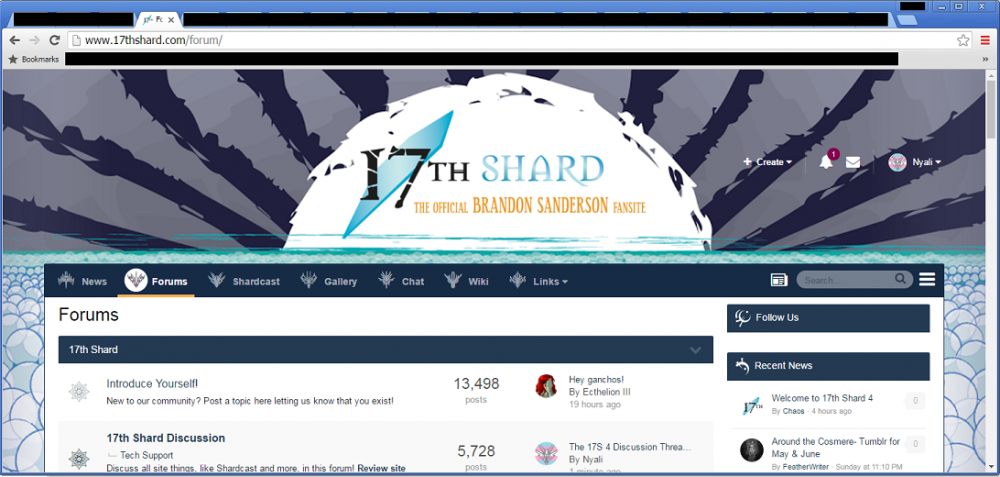
1600 x 900 on that monitor, 1440 x 900 on the other one. I don't run browsers full screen though, and that image was scaled down 75% so it didn't overflow the forum. EDIT: For contrast, here's the normal front page with the adblocker turned off (also sized down to 75% and with personal info blacked out):
-
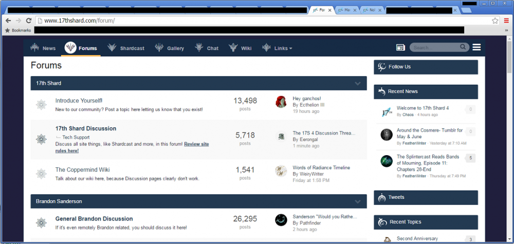
So, here is what the site looks like with the header and background blocked (screenshot scaled down to 75% and personal info blacked out): At that resolution, the header image was taking up about 50% of the screen. I find this gives me far less of a headache (I'm pretty photosensitive) and lets me read stuff without having to scroll past the header image every time. The only problem with doing this is that because the notifications, messages, and followed content links are all missing, I had to bookmark those pages to get to them. To me, that's a small price to pay for a far more condensed site that's easier for my eyes to deal with.
-
(I'm having some serious issues with quotes, btw - if I take a partial post and clear it and then click "quote" on another post, the quote comes in but fills the entire post such that I can't hit enter anywhere or type outside the quote) That doesn't do what "My Content" used to at all. That shows new posts in topics you've posted, not in threads where you've posted. If you didn't start the thread, the thread doesn't appear there. This is closer to what was asked for: http://www.17thshard.com/forum/followed/?type=forums_topic&change_section=1 However, that only works if you have autofollow enabled.
-
Eh, if you hide the background and the logo, they no longer fit the aesthetics since all the other circles are gone <.< I'm joking - I do get your point, I just hate whitespace. Also, this site really is hurting my eyes - the old one didn't for some reason despite having a relatively similar color scheme. I recall it having less crazy amounts of white though. Maybe that's just because of the old background/logo, which weren't white. Or maybe it's just because of all the extra spaces on old posts and in sigs that will be fixed later. Regarding the rep system, well, then I would suggest getting rid of it. Keep the upvotes/downvotes, ditch the rep system. That way, people can downvote posts they don't agree with without it saying something negative about the poster. Having the titles without the number might be nice if you're someone who's really familiar with the site, but to a visitor, it's completely meaningless. Sure, bridgeman is lower than stormfather, but a lot of the other ones are not as clear, especially ones from works you haven't read yet. If the point of the rep system is to give new members a rough relative sense of someone's seniority on the site, well, we have a post count for that. If it's to instead give a rough relative sense of how much a person contributes to the discussion, well, the ranks without the numbers are really meaningless for that. Is God of Colors higher than Lerasium Mistborn or Stormfather? I have no clue, those all sound really high. Certainly higher than, like, Dragon, which is just a race from Yolen, right? Splinter has to be pretty low too, because Returned and Spren are splinters, so it's right around there, right? Truthless are the lowest of the low, so that's probably a negative rank, likely down there with Midnight Essence, which is just an evil Spren. In other words - I think the ranks, while somewhat interesting when we have context (ie: numbers), are totally meaningless without them. Also, without the numbers, the ranks look like titles people have chosen. Some of them are pretty negative. In context, whatever, they're clearly linked to rep, but out of context, I certainly don't want to be a Gyorn. I also don't want to be marked as a Silent Gatherer or Bloodsealer, and I have no idea what a High Prelan even is
-
A few tips: If you're using uBlock Origin, you can block the giant header on all the emails (at least in gmail, or, well, at least it worked for me) by adding this filter to your inbox: ##div:nth-of-type(2) > table > tbody > tr:nth-of-type(2) > td:nth-of-type(2) > a[href="http://www.17thshard.com/forum/"] To hide this site's entire header, including the menu (sadly), you can block: ###ipsLayout_header > header Nothing I try seems to be able to keep the menu, unfortunately. You can block this site's background though, which makes the background navy blue, if, like me, you find the new site too bright for your eyes. It doesn't help much, but I find it helps some: ||www.17thshard.com/images/new/background13sized.png Also, don't forget that if you want a new line without the paragraph break, you can hold shift and hit enter and it'll do just a newline. This was true on the old site too, but there, there was less extra space after the enter key by default, so it wasn't as necessary.
-
When you go to "Mange Followed Content," do you click down to the "Topics" section? Weirdly, it defaults to "Articles" instead of "Topics." I find Topics something I'd check constantly and Articles something I'd only check occasionally, so I kinda wish Topics were the default. But, other people likely use the site differently than me, so maybe it makes sense to others!
-
A few comments on the new design, some good, some bad. For reference, in general, I hate extraneous whitespace and wasted screen real-estate, and I think the Internet's current "modern look" is terrible. Also, I hate change. So, please keep that context in mind! The logo at the top takes up literally half my browser window at the sizes I generally use. I personally find it rather obtrusive. In addition, I can generally edit sites to remove design elements I dislike, but when I add the logo to my adblocker to hide it, hiding it also hides the upper right corner menu. That menu is a great feature and I really don't want to hide it. I can't seem to find any specific site element to block that will hide the logo and restore the lost screen real-estate, but won't block the upper right menu. I'm sure I'm not the only Sharder who uses adblockers to remove undesired design elements from websites. Has anyone found the right element(s) to block to hide the logo and regain the screen space, but keep the menu? I don't like round profile photos. They take up the same exact amount of screen space as a square picture, except they guarantee extraneous whitespace in the image box outside the circle. And, since images are saved as rectangles, you have to guess what's going to be cut off of the image, or use trial and error. There's no functional reason to use a round image, using them is a purely aesthetics-based decision, and it's not an aesthetic that I particularly like. From a functional standpoint, using round images limits the profile pictures and adds to the feeling of extraneous unused screen space so popular these days for some reason I can't fathom. Leaving the reputation titles in the sidebar but getting rid of the reputation number seems like an odd decision - the titles are meaningless without the number, so why not hide those too and just put it all on people's profile pages? While I don't generally like "modern" looks (they tend to be full of extraneous whitespace - I prefer more functional site design), the new site does look nice, if looking nice and modern is what you want from your forum site. Personally, as a design minimalist, the airy modern look is just not my thing and I wish I could skin it to be more like it used to be (or better yet, even more simple/compact), but that's possibly just me. I like a lot of the new features. The notifications seem nicer (once I disabled the intrusive browser popups - honestly, I worried my computer was infected by malware for a moment) and the content viewer makes it easier to find what you're looking for when going through your own old posts/topics/etc. I don't know if you could easily view followed threads you hadn't posted in with the old site, but you definitely can with the new one, and that's a nice feature. The old editor kept glitching and doing things like doubling all the text in posts that contained copy/pasted quotes, or refusing to underline anything that was underlined in a post you quoted, or anything you posted if you were posting from the mobile site. Also, sometimes nested spoiler tags caused the post to explode, and the newline spacing before and after a spoiler tag was seemingly random (sometimes it'd be there, sometimes it wouldn't be, even if everything was the exact same in the graphical editor and the raw text editor). So far, I haven't run into any such bugs on the new site. When at home, I pretty much only post via the mobile site, so having a fully featured mobile site sounds great. I'll have to check tonight how it looks, but I'm pretty happy about that change. Defaulting audio notifications to "on" was really mean D: I had my sound up pretty high because I was listening to something fairly quiet, and I jumped when I heard the first notification and had to take out my earbuds until I could find and disable that option. I'm not complaining about sound notifications - some people find them extremely useful (though I do not). But, I certainly wasn't expecting them!
-
It isn't what I was looking for, but I did find what I was looking for (points at edit to previous post).


