Harakeke
-
Posts
260 -
Joined
-
Last visited
-
Days Won
2
Content Type
Profiles
News
Forums
Blogs
Gallery
Events
Everything posted by Harakeke
-
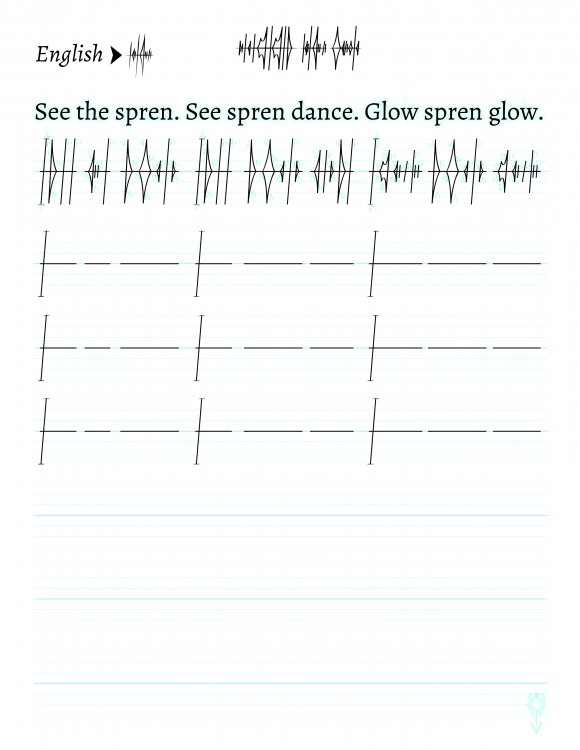
Great work so far! Here are some quick-and-dirty transcriptions. Here's my own contribution, although I'm not particularly happy with the last stanza: This ketek, attributed to the Heraldic Epoch poet Harakekarah, was purportedly inspired by the last desperate assault against voidbringer strongholds during the Final Desolation. See page 82 of Shadows Remembered and note the undertext.
-
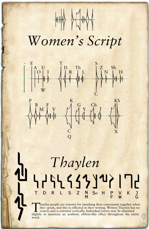
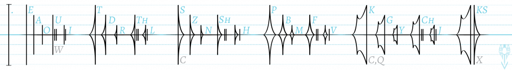
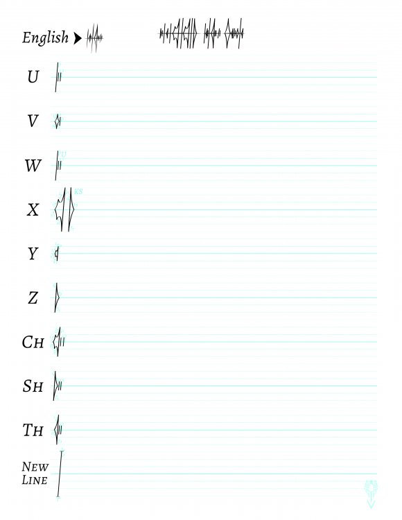
Sure - the goal is to have a sentence that uses each symbol in the women's script so that folks can practice their writing. Please don't post Oathbringer spoilers. I'm waiting to read the book when it comes out.
-
It's OK to use them - they're just written using other letters. For example, the English word "cowpox" would be written "KOUPOKS" in the women's script. (And that's using the simple Navani-style transliteration method. Jasnah-style phonetic transliteration gets even trickier.)
-
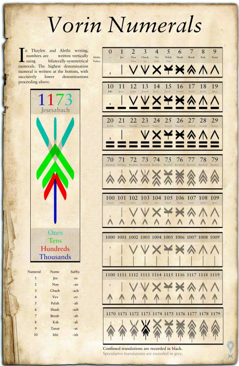
I'm working on revamping my women's script primer pages and would like to include some cool sentences for folks to practice their penmanship with. Can anyone compose a ketek that includes every letter in the Alethi alphabet? This includes Th, Sh, and Ch, but not necessarily X, Q, W, or C. The best ketek(s) will be immortalized in the Translation Guide, plus I'll write it out in the women's script for you!
-
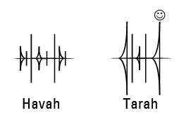
It appears to be made up of lines…? They’re not exactly tendrils or tentacles, they don’t grasp or reach… they just keep dividing and multiplying and combining into different patterns. The lines always seem to be connected, either at the central root of the Pattern or by dividing off from a root line, different shapes mix and overlap and reduce by multiple dimensions. It almost seems to phase in and out between two and three-dimensional space. I think it prefers a surface to connect with, but I have seen it move through the air on rare occasions. It certainly presents some sense of depth, but the bottom doesn’t appear to possess any consistent dimensions in terms of size. I am almost certain that I have seen this Pattern somewhere before. It shares some resemblance with the creatures I observed in Kharbranth but without the body and those strange robes. Is it possibly a child or servant of theirs?
-
-
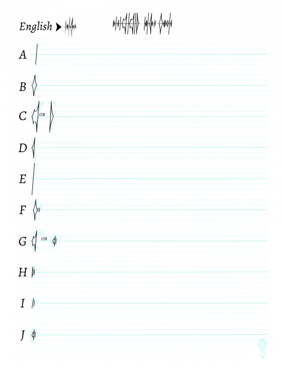
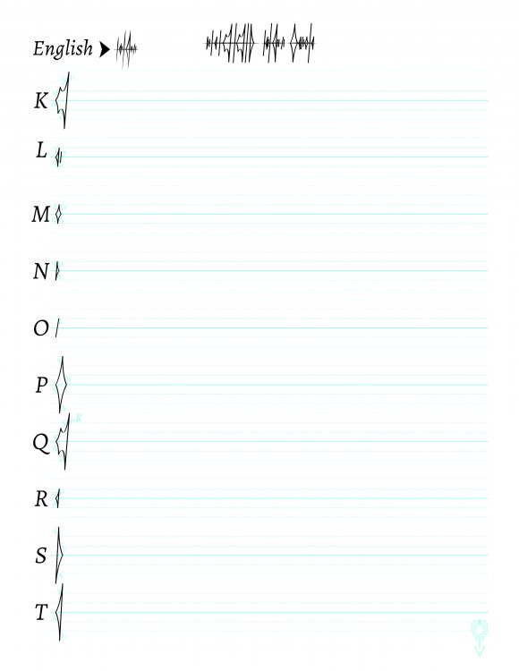
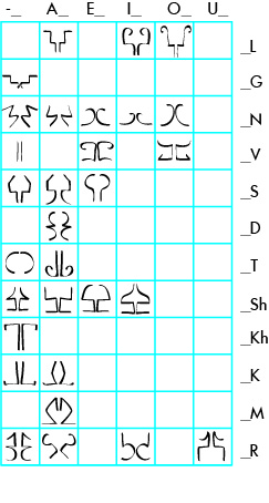
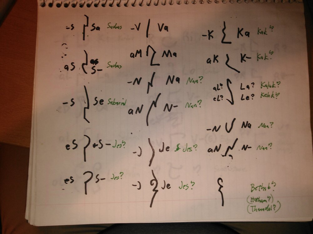
I took a crack at organizing my notes a bit. It's mostly guesswork, but I think I like it better than the current single-letter key. :
-
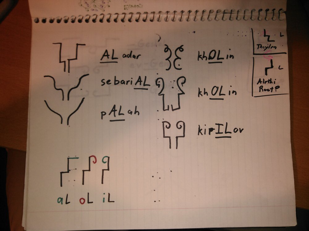
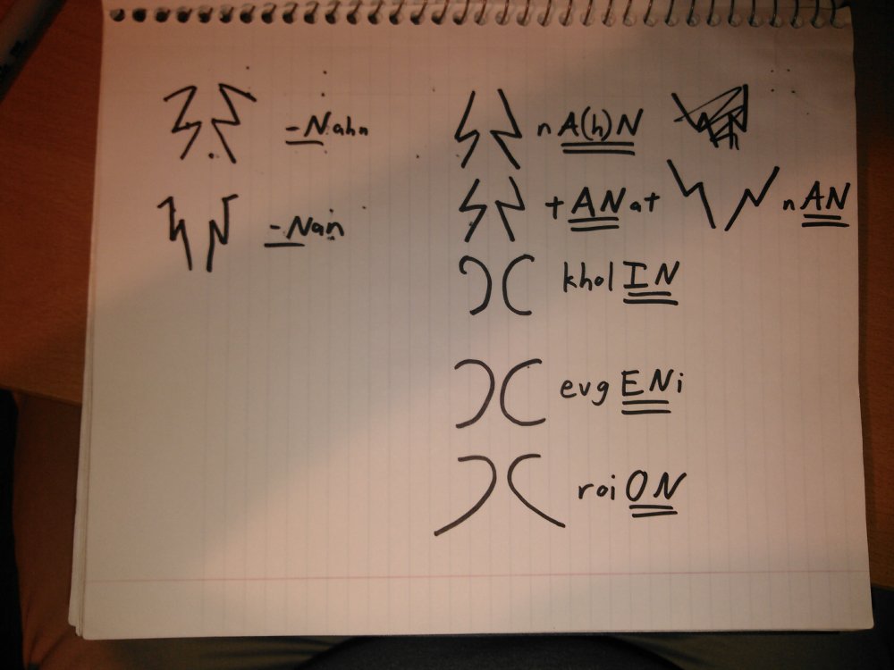
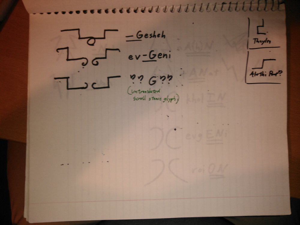
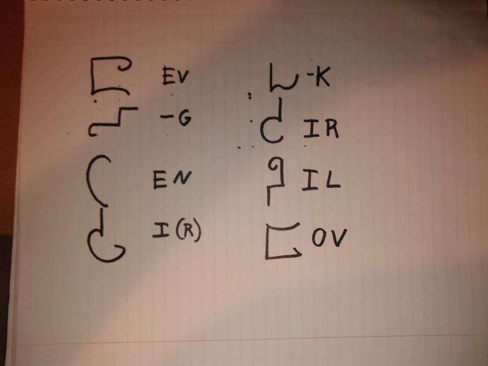
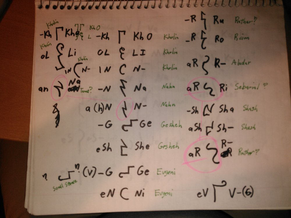
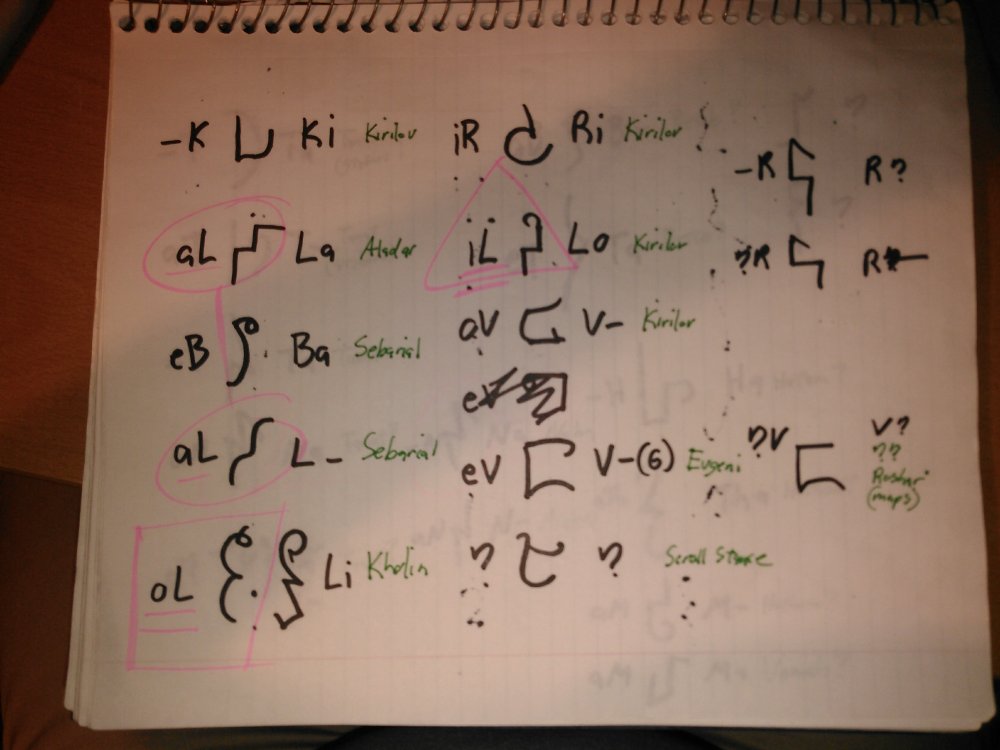
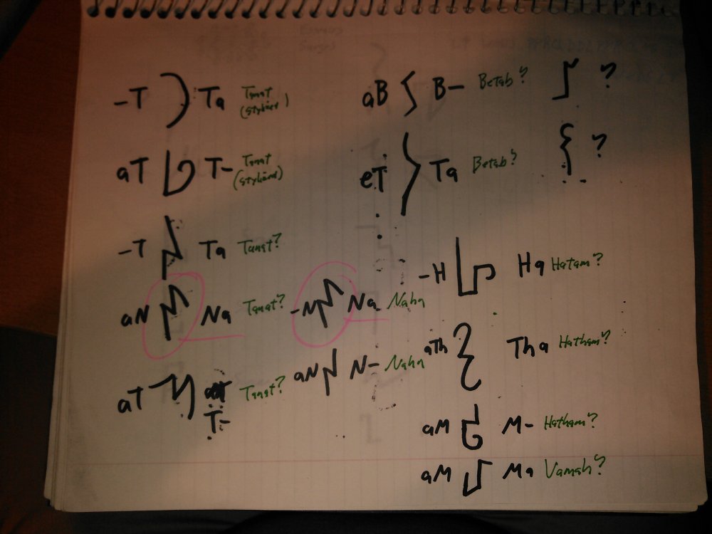
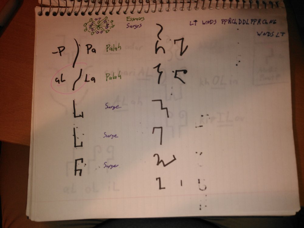
I recall playing around with it early on, but we didn't have as many high-resolution images and transliterated words to go on back then. Now we have vev gesheh, most of the highprince names, and now Evgeni Kirilov! There are also three sets of related glyphs that I think correspond to the ten fundamental glyphs (whatever that means...), ten Essences, and ten Radiant Orders/Heralds. I think each set translates to something along the lines of Jes/Jezrien/Jezerezeh, Chach/Chana/Chanarach, etc. That's still a working theory, but so far it seems somewhat self-consistent, and it gives me more letter combinations to play with. What got me thinking about the syllable pairs again was how Isaac said making the glyphpair took a huge amount of time. Under the current model we've been using to attack the glyphs, we assume you throw out all the vowels, draw the basic consonant shapes, and then add a bunch of decorative lines. Pretty simple. But if that was true, it should have been pretty easy to make a new glyph -- just lift the consonants from the secret master key (since they're all letters we've seen before in official art), add some decorative flair, and call it done. But what if instead of only 15 or so consonants, the secret master key actually has something like 75 consonant-vowel pairs -- only a few of which have actually been used so far. Maybe any pair that hadn't been used yet had to be created from scratch... That'd take a long time! This would also explain why after all this time, we still haven't satisfactorily cracked the glyph translation -- we only have a tiny correspondence between written glyphs and the sounds they represent. If that's the case, then most of the glyphs in the artwork represent unknown syllables, and we can't even assume they necessarily follow a pattern! Just because the glyphs share a common root with Thaylen doesn't mean they necessarily work the same way, and just because we don't seem to see any vowels doesn't mean they aren't there -- maybe they're hidden! So with that in mind I went poking around the glyphs we know the pronunciation of looking for patterns of syllables. It turns out there are very few instances where we actually have multiple different vowels both before and after the consonant for comparison. It seems the Alethi like their letter A almost as they like their symmetry. (For now, I'm going to assume for the sake of my sanity that sub-glyphs don't represent 3-letter pairs, because that'd require something like a 300-400 symbol key...) After spending way too much time staring at obscure, highly-pixelated glyphs, I think the most compelling candidate for a syllable pair is *L. We have AL in aladar, sebarial, (and palah, if my hunch is correct), OL in kholin, and now IL in Kirilov. It always bugged me that the L in Aladar was so different from the L in Kholin. My idea now is that the basic L subglyph is sort of a step shape with three line segments. To write AL, you add a third step at the top. To make it decorative and calligraphic, you can round off the corners so it's more like a flowing squiggle. To write OL, you add a curliecue to the top. To make it decorative, you can throw in some warping and extra lines at the bottom (which don't matter, because the important information is coded at the top). To write IL, you add a curliecue going in the other direction. *N is also a good candidate for comparison, because there are examples with contrasting vowels before and after. We have -N (with no preceding vowel) in Nahn and Nan, AN in nahn (assuming the h is unwritten), nan, and tanat, IN in Kholin, ON in Roion, and EN in Evgeni. I don't think the syllable pair is based on the following vowel (e.g. NA), because of the difference between NAhn and NAn/taNAt. -N has four lines, AN has 3 lines, and IN, EN, and ON are variations on a simplified circular swoosh. We also seem to have two variations of *G. There's a similar -G in both Gesheh and Evgeni (since the letter before the G is a consonant). There's also a fairly similar sub-glyph in one of the scroll stance glyphs, except it has a curliecue on the end going in the opposite direction (similar to the proposed IL vs. OL). Assuming that each sub-glyph corresponds to a vowel-consonant pair, I would guess your glyphpair comes out something like this (drawing the righthand side only) It still feels a little off, but I'm happier with the pairs than I am with the single letters. Maybe you can rotate the subglyphs and they keep their meaning? Here are some other notes I jotted as I looked over the glyphs, much of which is highly speculative. *R and *V also seemed like promising avenues, though the explanations there are more difficult to articulate -- largely because the Highprinces seemed to go "Storm it, Rs are tricky. My signature is now officially a squiggle instead. Any scribes who complain will be reassigned to bridge duty."
-
That's some great analysis! It's got me wondering again if we should really be considering the glyph components in terms of consonant-vowel pairs. There might be something going on with how consonants are rotate/reflected that's determined by the surrounding vowels?
-
Too bad you name isn't "Tithzh Pamfeychij" -- you'd have singlehandedly cracked the entire key! ;-)
-
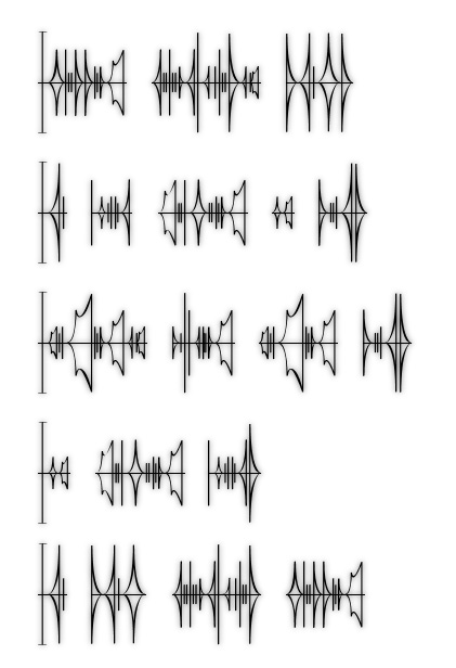
I think I dabbled with something like that a while back, but if I recall it had a bunch of typos because I kept swapping my Ls and Rs. If you wanted to write some out, that'd be awesome, and I'm sure folks (myself included) would be happy to take a look! I think there are also some examples of fanart with women's script in the Stormlight image gallery. Sure! If you print the .jpegs out in"multiple images per page" mode, you should be able to get 20-40 lines per page.
-

Shire Mint's Mistborn Coins Are Awesome, and Here's Its Kickstarter
Harakeke commented on Chaos's article in Brandon and Book News
They're certainly beautiful, but at around $10 each (give or take, depending on backer tier) they're significantly pricier than other fantasy coins I've seen, which typically go for less than a dollar each. Is there something about the antique minting process that drives up the price? -
Simple natural selection. Shardblades that enter the physical realm near other parts of the wielder's anatomy (like for example in the middle of one's heart) would tend not to get passed along to one's heirs. Incidentally, this also solves the "too many shardblades at the Recreance" problem. (only half joking...)
-
I've always suspected the portraits indicate which Heraldic Attributes (e.g. Jezrien = Protecting/Leading) feature prominently in the chapter. per Peter Ahlstrom:
-
Hold on, I've somehow gotten my L's and R's mixed again... I need to double-check those images to make sure they're correct -- but after that, please do! Edit: Okay, I think I've got it sorted now. Interesting. So (without prying into the super-secret spoilers), it would look something to the effect of: , yes?
-
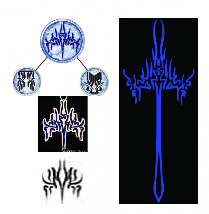
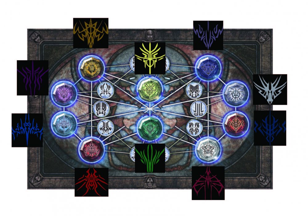
I had another thought: most fan interpretations associate the large glyphs in the Double Eye with the Radiant Orders, (this seems like a reasonable assumption -- especially given the cover art for Edgedancer) but according to these annotations, they are actually the Essences. Denoting a Radiant Order requires one Essence and the two adjacent Forces. I'm wondering if the elaborate "sword form" glyphs could be broken down into those three components, which together make up the glyph for the Order.
-
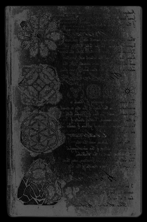
Did anyone ever figure out what's written on the opposite side of Kabsal's notes on cymatics? It's probably just filler text to make the art more authentic, but here's what I could make out after a few quick tweaks:
-
I agree. Some of draft glyphs are a little bit simpler than the final published forms, so there are perhaps a few things to be gleaned about their construction -- but not much. Interestingly, the glyphs for <Edgedancers> <Dustbringers> and <Lightweavers> underwent substantial revisions shortly before publication. Something to keep an eye out for in future annotations would be whether the orders themselves had different names in the corresponding draft. If so, this would suggest that the Surgebinding glyphs are direct English transliterations. If on the other hand "Edgedancers", "Dustbringers", and "Lightweavers" were in already the draft text, it would suggest that only the corresponding Rosharan word was changed, and that the Surgebinding glyphs are in "native" Alethi. (I suspect the latter is the case, since the handful of glyphs that have been fully deciphered have all been fully Rosharan.)
-
Stick is not an overhyped character. Stick is a stick.
-
Foreshadowing in Navani's Notebook?
Harakeke replied to Duke of Lizards's topic in Stormlight Archive
Pssh. The Alethi women's script was pretty straightforward to decipher. Now when someone finally cracks the glyphs, that'll be genius! You may be on to something with the foreshadowing though. Navani's other notebook page from Way of Kings mentions the fact that fabrials work by capturing and imprisoning spren. This is something that isn't stated explicitly in the first two books... minor spoilers: It's possible that we'll look back and realize who Navani was scanning when she tested the emotion fabrial. I think that Navani's notebook pages are roughly contemporaneous with the surrounding narrative. Words of Radiance includes sketches and descriptions of a conjoiner fabrial, and if I recall Navani has a face-to-face conversation about that same device with Dalinar. -
Here you go: https://drive.google.com/file/d/0B19mpDUN_8rSY2N2dXhRSnB6aG8/view?usp=sharing One observation that may help with your hunt -- in both of the instances where glyphs are presented in a list (highprince names and fundamental glyphs), the list has reflected symmetry. The first half is rightside up, while the second half is upside down. one two three four five ~~~~ xᴉs uǝʌǝs ʇɥƃᴉǝ ǝuᴉu uǝʇ
-
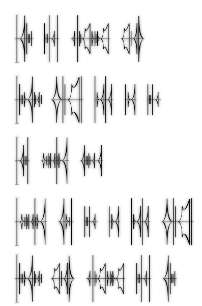
 Just a little doodle I threw together.
 -
That would indeed be very helpful! I can send you some vector versions of my working files if that would be useful.
-
Personally, I prefer to use straight transliteration by letter like in the samples of Navani's writing, but we also have an example of phonetic transliteration from Jasnah:
-
Temporary image dump until I get a chance to fix the first post: