Harakeke
-
Posts
260 -
Joined
-
Last visited
-
Days Won
2
Content Type
Profiles
News
Forums
Blogs
Gallery
Events
Everything posted by Harakeke
-
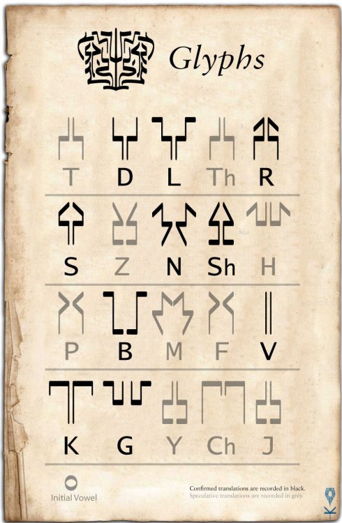
I believe he's confirmed that the Women's Script alphabet is correct for all the letters that we've seen so far, and also that X would be written as KS. Edit: And as soon as I say that, I realize that I'm the one who's somehow mixed up L and R somewhere along the way! Just goes to show you - don't always trust secondary sources, especially if you make them yourself! I'm gonna have to redo the keys... Any suggestions for improvements to the Women's Script guide as long as I'm at it? There's even some awkwardness between different languages within the Vorin family. For instance, Shallan (a native Veden speaker) picks up Alethi easily but struggles a bit with the pronunciation of Thaylen.
-
I think this is a repost of that incorrect font that's been floating around. L and R are swapped, and a lot of the double-diacritic letters are the wrong size. There's a proper font that I made somewhere in the middle of this thread. Maybe I should dig it up and put a link on the first post... Is there a way to post .ttf files to the 17th Shard media directory or something? If not, shoot me a message if you want a copy of the font and I can send it to you via email. It's a little finicky to format, but I believe all the letters are correct. The diacritic transformations in Women's Script generally tend to indicate fricatives in a roughly similar place of articulation: A>U, O>I, D>Th, L>R, Z>Sh, N>H, B>F, M>V, K>Ch, Y>J When I first broke the code for the Women's Script way back when, I actually did use all sorts of crazy diacritics. I think you can find the original handwritten key archived somewhere at the beginning of the thread, along with some comments from Peter/Isaac. It was a mess though, so I simplified the chart to make the correspondence with English more intuitive. When it comes to glyphs, the subglyphs in grey are purely speculative, based on portions of untranslated glyphs and wild guesses at proto-Vorin roots via Thaylen. I suspect that there has to be some sort of glyphic notation for H, otherwise it would very hard to write "Hatham".
-
Good catch! Those Veden numbers had never quite felt right.
-
As I recall, there are a number of issues with that old font. This comes out to: rahy? be?ohl dea? stleng? be?ohl ?eaknes jo?lney be?ohl destina??h It should look more like: Edit: As long as I'm at it, here are all the Ideals:
-
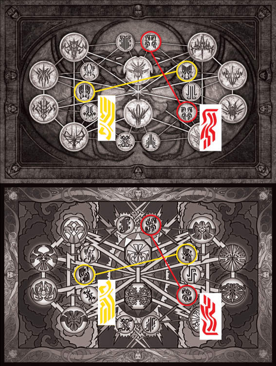
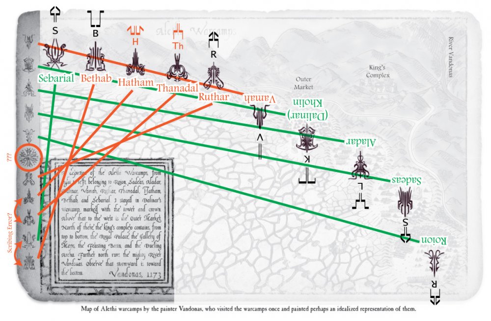
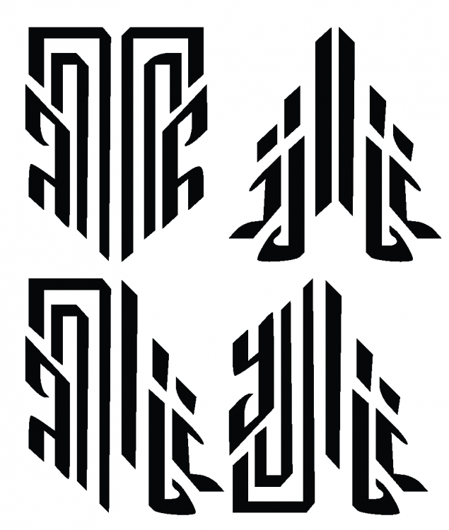
Okay, I think I have another angle on the highprince names. The key is the layout of the painting of the Shattered Plains in Way of Kings. In the inset, the artist Vandonas helpfully describes the order in which the warcamps are situated, from north (right) to south (left): Roion, Sadeas, Aladar, Dalinar (Kholin), Vamah, Ruthar, Thanadal, Hatham, Bethab, and Sebarial. There is also a sidebar to the right with a series of eleven glyphs. Note that the top five glyphs are upside-down; the sequence is mirrored around the "compass rose" glyph. Five of these glyphs can be positively identified from the battlemaps, which have both English and Alethi notations: Roion, Sadeas, Aladar, Kholin, and Sebarial. That leaves Vamah, Ruthar, Thanadal, Hatham, and Bethab as the unknowns, plus the "compass rose". The order of glyphs in the upper half of the sequence (starting at the compass rose and moving out) corresponds with the order of the warcamps. Roion is first, followed by Sadeas, and so forth. This is further confirmed by the presence of Dalinar's tower and crown glyphpair at the appropriate camp. The bottom sequence of glyphs is... kind of a mess (see the orange lines in the image below). Sebarial's camp is farthest south, but it is second to last in the lower sequence. I suspect this may have been an error on the part of Vandonas, who after all is a painter, not a scribe. He couldn't even be bothered to learn the name of the river -- he just went ahead and named it after himself! To address this issue, let's assume that that Sebarial's glyph got swapped with Bethab's. Likewise, I suspect that Hatham and Thanadal have been similarly reversed. If these pairings are correct, it also sheds some light on the method of construction for "cursive" glyphs. In each of these glyphs, the initial letter is clearly visible in the upper center. Thanadal's initial Th is somewhat distorted, but it's done in a manner that is consistent with the "inflated" surgebinding glyphs. The other letters, such as the N in Kholin and Roion, are much more heavily stylized. This makes sense. An illiterate spearman wouldn't able to "read" all the component elements, but he'd be able to recognize, "Hey, that glyph has a big K and looks like a tower. Must be Kholin. That one has a big S with squiggles like skyeels. Must be Sebarial." Conversely, a moderately educated person -- say someone in the Ghostbloods -- could mash together glyphs phonetically to crudely spell out words. The positioning connection makes me pretty confident in the identification of as Vamah, which in turn calls for an update to the translation key. It's easy to see the initial V, so the other squiggle must be "inspired by" M. However, it doesn't really resemble the speculative M in the key, which I was never particularly happy with anyway. The current guess is just a placeholder copy of N, since we don't have a concrete example of the Alethi M, and in Thaylen M and N are written the same. So I think the subglyph for M needs to get reversed. It makes the contortion in Vamah a little less painful, and there's an element like that in one of the Stance Scroll glyphs that has always bugged me: Here's an updated key with revised speculation for M, the initial vowel marker, and some gut-feeling guesses for Z and Ch.
-
Great analysis. I agree that native Rosharans would find what we're doing here quite silly! They'd certainly comprehend glyphpairs as cohesive entities, just like English readers parse entire sentence chunks at once. We only sound out words letter-by-letter when we're learning to read, which is what we're doing here with the glyphs. We've exhausted the easy answers, but I think we may still be able to tease a few secrets out of the more obscure glyphs Nice catch -- seems plausible to me! There is also an English -> Alethi phonetic transliteration of Jasnah's journal hidden in Shallan's recycled sketchbook pages, which you may find useful.
-
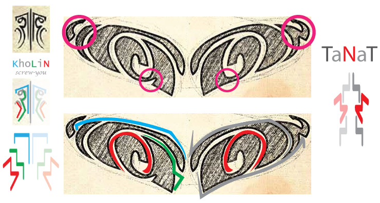
Be advised that trying to tease letters out of the stylized glyphs can really lead you deep down the pareidolia rabbit hole. Isaac (the artist who designed the glyphs) has basically said "Hah! Good luck with that." (Check out some of my early "decipherings" further up in this thread if you want a laugh!) I commend your efforts though. Other lines of investigation have stagnated, so you may uncover some interesting things! That's an interesting interpretation, but I'm more inclined to read into the negative space of the Kholin tanat tattoo. Tanat is tricky because we don't have a non-stylized example of the Alethi subglyph for T, but the Kholin half seems to plausibly match up with what I see in the regular version of the glyph -- taking into account that it's highly stylized to cover up Kaladin's preexisting brands (cf. the treatment of gesheh in the same tattoo though, which uses positive space). Note that the image in jofwu's glyph thread is the left half of the tattoo glyph, but you're matching it up with the right half of the warcamp glyph. Personally, I'd be reluctant to throw out the symmetry and positioning rules. They seem to be fairly consistent across all the decipherable glyphs, and without them "reading" the glyphs becomes completely impossible, because component graphemes could be literally anywhere. (That being said, I suspect Navani may have done something like that in her ketek, possibly for artistic effect.) I'm rather confident the loop on the L in Kholin is just for decoration. You can trace how it develops from a curlicue on the warcamp illustration to a shorthand loop on the battle map. It's also absent in Aladar and Sebarial (though Sebarial's glyph is especially horrible when it comes to deciphering, which seems fitting). Likewise, reversing the symmetry of L is problematic for both Aladar/Sebarial and the underlying connection with Thaylen via proto-Vorin. Similarly, you can trace the evolution of N from the crisp versions in nahn to a lazy stylized swoosh in Kholin. It's more of a doctor's signature scrawl at that point, rather than a proper letter.
-
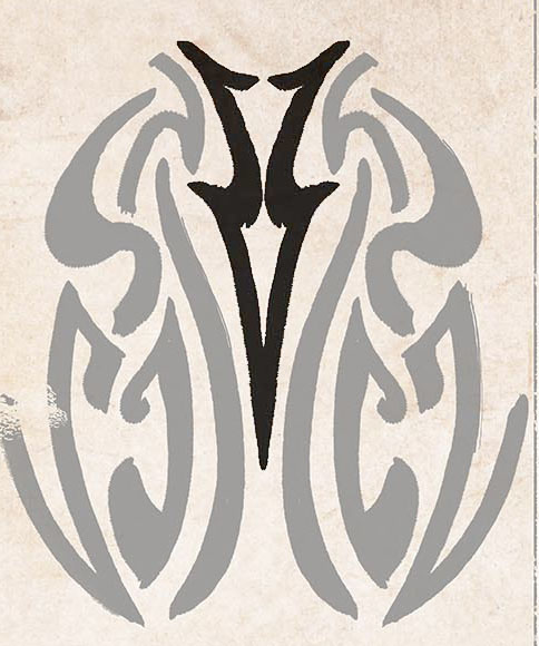
The highprince names are really squirrely, with lots of exaggerations, artistic distortions and possibly some "contractions". This highlights how far a glyph can deviate from its original root, and how hard it is to reconstruct graphemes from these examples. There are much clearer instances of N in Kaladin's Nahn. If I recall, L and V are based on their Thaylen analogs, with plausible translations of Vamah, Aladar, and Kholin as tentative confirmation.
-
You could also set them up in a sub-folder in the 17th Shard Stormlight Archive image gallery: http://www.17thshard.com/forum/gallery/category/6-stormlight-archive-art/
-
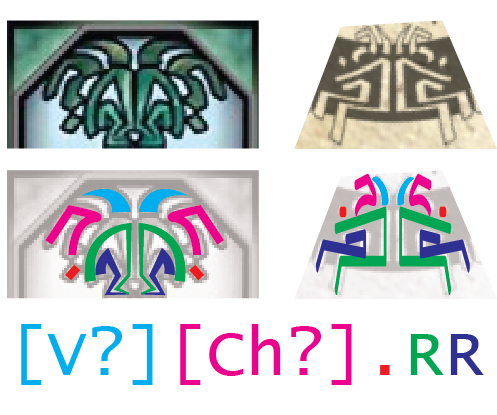
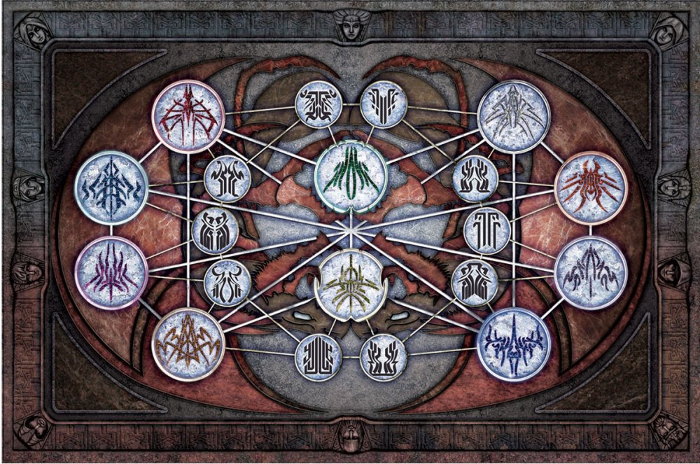
These are definitely the same glyph -- awesome find! I'm less convinced they say Rishir/Roshar though, because I really can't find an Sh anywhere. The three elements along the top (teal, magenta, red) strike me as decorative elements. Glyph symmetry and how it might relate to pronunciation is something that hasn't been examined all that much. There's WOB that the pronunciation/meaning of glyphs is memorized, not read phonetically. There do seem to be some structural conventions though, so I don't think someone would necessarily have to reconstruct the proto-Vorin root word to be able to write a glyph. Artists who create new glyphs (like Navani's Ketek) are probably accustomed to seeing each "letter" as a pair of mirrored symbols. Most glyphs have simple symmetry along the vertical axis, similar to how the Alethi women's script has symmetry along the horizontal axis: I AM NOT A VOIDBRINGER I ᗄʍ NO⊥ ᗄ ⋀OIDᗷᖉINCEᖉ There are some weird counter-examples though, like Kaladin's tatoo modification. Taken together it's roughly symmetrical, but each glyph only has one half of the component graphemes. Since he was modifying an existing glyph, this is probably not standard orthography -- like how company logos will tweak letters for aesthetic effect. Plus, writing is a feminine art in Alethkar, so even though his Vev Gesheh is pretty spiffy, he probably wasn't formally trained in the finer points of glyph construction. Then there are the so-called "voidbinding" glyphs with their strange rotational symmetry.
-
Yep! And for the super-nerdy, you can tell which revision a key is on by the Vorin numeral next to my signature. The higher the number, the more recent the version.
-
This is fantastic!
-
Kholin is actually one of the more well-behaved glyphs, and we have examples of several different depictions. Picking out the component elements isn't so bad as it is with the other Highprinces, whose glyphs are more ostentatious. I particularly appreciate the Tower version of kokh, which practically scream Ks at you! There does seem to be somewhat of a standard way of organizing the component graphemes in glyphs, moving outward and down from the starting point in the upper center. Yep! In fact Dalinar's glyphpair for "Kholin" is the Tower and Crown shown above, while Elhokar's is a Tower and Sword. We haven't seen what Elhokar's looks like, but I imagine you'd be able to tell the resemblance at a glance. These probably aren't particularly accurate, but they were fun to make...

-
 The best examples would be the annotated versions of the pages from Navani's Notebook: http://coppermind.net/wiki/Navani's_notebook
 -
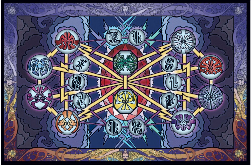
The best explanation seems to be C. What I took to be rotated letters early on are better explained as screw-you lines added for decorative effect. The "voidbinding" glyphs seem to share the same component graphemes as their surgebinding counterparts, but they use a sort of rotational symmetry, rather than mirror symmetry like the Alethi glyphs. Here are the endpaper images rotated and aligned, for anyone who wants to explore possible geographic connections:
-
That's a super-old, outdated version. My idea that orientation mattered didn't pan out. The most up-to-date chart is in the first post here.
-
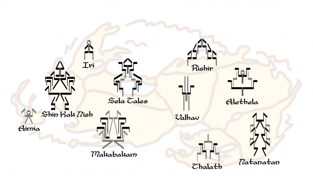
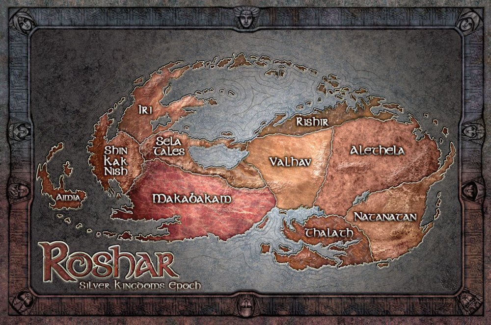
That's a fantastic observation! I like your idea that these could correspond to specific locations. Another possibility might be the 10 Silver Kingdoms.
-
I agree with you. I've suspected that Shardplate is a natural, semi-alive sort of fabrial that operates somewhere in between how artifabrians imprison spren and greatshells (and Listeners) form symbiotic relationships with them.The descriptions of shardplate in action struck me as very organic, almost like the wearer is piloting a living mech. Modern shardplate requires stormlight-infused gems to come "alive" or regrow lost or damaged parts, but perhaps the Radiants had a more natural and effective means of powering their plate. Regarding the Radiant's helmets -- don't the individual elements of modern shardplate shatter and disappear when they are sufficiently damaged? Maybe the Radiants could simply destroy/regenerate portions of their plate at will.
-
There are a couple examples of spoken Alethi, and we also know that J is pronounced like Y. sas nahn = without honor shash = dangerous gesheh = bridge jes, nan, etc. (all the Vorin numerals) There's also the scene where Shallan? is trying to decipher the Ghostbloods' funky phonetic glyph sentences, and I believe she reads it aloud. The phrase "sas merom" also comes to mind, but I forget where I may have seen it. You can also pick up some linguistic differences in the variations different nations have for the Heralds' names. WOB: Brandon Sanderson @BrandSanderson 21 Oct 2014 @ArgentSun @PeterAhlstrom @IzykStewart The glyphpairs are more Chinese influenced. But Isaac will have to answer on Thaylen. Isaac Stewart @IzykStewart 2 Dec 2014 @ArgentSun @BrandSanderson @PeterAhlstrom Thaylen and Alethi are related kinda in the same way Korean [hangul] and Chinese chars are related. I agree!
-

About the 10 gas giants [AU Spoilers]
Harakeke replied to Full Metal Rithmatist's topic in Cosmere Discussion
In the colorized version, the gas giants match the polestones that correspond with the numbers in the Ars Arcanum. I wonder if those planets might rain the associated gemstones, similarly to how astrophysicists speculate that gas giants in our solar system rain diamonds. Another neat detail: the circle for the planet Roshar has a simplified icon for the Double Eye of the Almighty. In fact, all of the "POV" planets have a corresponding icon. -
Please do! I love the great work you folks do with the wiki!
-
I just finished re-listening to the Empereror's Soul audiobook and was wondering the same thing myself. I decided that she probably could have -- if she wanted to. When she uses her essence mark, her hair shortens and her nearsightedness disappears (by offhandedly mentioning in the forging a history that her eyesight had been treated). So it seems possible for a Forger to change a person's body without the advanced medical training of a Resealer. The thing is, I don't think a soulstamp override can "inherit" very much from the target's natural unmodified state. What makes it so difficult is that the Forger has to rewrite the target's entire history in a way that isn't too far off from its actual history. So a stamp that said "everything was the same except the Emperor sneezed and the arrow hit his arm" wouldn't hold for very long -- because instead of "everything was the same" you'd have to actually spell out everything leading up to that moment (and then you're back to the original problem). The key I think is in the epilogue, where we learn that There were probably countless shortcuts such as this one Shai could have taken, but then her work would have been nothing but a crude hack -- much like the mass-produced historic replicas she so disdained.
-
Makes sense. Trying to "read" the root words in the stylized glyphs has always been a rather silly exercise, but I enjoy speculating! We touched on this topic a bit back on page 3-4. Not only is there a tower and crown glyphpair for kokh linil, but there's also a sword & crown version, a simple glyph for the "contraction" kholin, and a stylized contraction as part of the tattoo. There's lots of room for creativity when drawing a glyph, but going from the "traditional" to "stylized" form is a very noisy transformation in which details can be both added and removed. The process doesn't seem to follow any particular rules apart from the "rule of cool". The takeaway here seems to be that traditional glyphs like sas nahn are easily decipherable, but that stylized glyphs like the highprince names and radiant orders are so noisy that it isn't possible to "reverse engineer" them. That isn't a big surprise. I'd been hoping we could somehow use stylized glyphs to fill in the speculative gaps in the basic key, but we've pretty clearly hit a wall. Guess we'll have to wait and see what goodies are in the next book! :-)
-
Yeah. I dunno' about tension and progression. You'd have to do some rotating/flipping, and even then it doesn't seem to work. But -- the "compass rose" and map border glyphs have a similar sort of symmetry in how they repeat, come to think of it. Maybe they're each actually be a pair of two palindromic glyphs.
-
I don't see any other pairs like this either, but it does hold true for the "voidbinding" chart as well. It doesn't seem to relate to any of the surge connections/oppositions?, which leads me to think the relationship is due to something linguistic, rather than realmatic. It bugs me that I can only make sense of Transportation and Gravitation by flipping them. I thought maybe the orientation of glyphs around the chart was mirrored, but this suggests there's something off with the key...