Jump to content

My take on Era 2-esque Scadrian handwriting (part 1 / 2 and a bit)


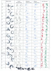
Inspiration and some info from @Honorless, thanks!

@LordOfCheesecakes, I'm  curious about your opinion too, I hope you don't feel like I stole the thing you were to do?

A question to everyone: are you interested in me doing part 2 and 2.1 (the last couple letters and other characters that didn't fit on 2 first pages of the table)? Or making those into vectors, but that's more work.

I made up some Terris letters that were missing, based on the ancient letter forms (chapter numbers in HoA) and some deduction.


From the album:

Alphabets, typography and similar [Cosmere]

· 3 images
  • 3 images
  • 0 comments
  • 9 image comments


Recommended Comments

Honorless

Posted

Damn... you did it, you son-of-a-gun, you actually did it! squee!

LordOfCheesecakes

Posted

Ooh, I love these! Great job! I love the art nouveau style letters as well, makes me want to see art nouveau style Mistborn art (which I think could be lovely, with flowing mistcloak tassels and all that. I might give it a try myself this weekend.) And the handwriting looks Mistborny (is that a word?), pretty, and practical! I love your sysyematic approach as well. So yeah, great work!

Eri

Posted

5 hours ago, Honorless said:

Damn... you did it, you son-of-a-gun, you actually did it! squee!

Daughter of a gun. And more like daughter of a riffle, I guess. The riffle being Riitho. Hmm, Riitho x Nightblood… mm… (yeah, she's from different fandom). anyway thank you all!

I'll post some more soon, I accidentally ("accidentally" as in: the Shan Elariel incident) did print type too. Like a normal print, with small letters being more geometric and less connected handwriting and big being simplified older letters. But I have one more page to do + a little bit.

Honorless

Posted (edited)

I really loved the Steel Alphabet evolution page when I first saw it on Coppermind. It made so much sense! From the Terris brushstrokes to the carved serifs of the Steel Alphabet of the Final Empire. I was so curious how the Steel Alphabet handwriting would look, I really wanted to see cursive Steel Alphabet. I did not expect it to look so Dravidian! (I visualized it as looking more Tengwar)

Also, I was wondering about the dots because they reminded me of diacritical marks and I found this:

Quote

Pagerunner

Any in-world significance to the new symbols for E and U [on the Badali Mistborn rings]? (Tin/Pewter with dots moved) Or is that just creative liberty to give each English letter a unique symbol for the jewelry?

Isaac Stewart

From the beginning, I built the symbols to also be an alphabet. Moving the dot to create a different vowels sound is something I borrowed from baybayin: https://i.pinimg.com/originals/1b/9c/6f/1b9c6f22fce5589c1d3dfc62bfc1d4b2.jpg … Also planned from the beginning over ten years ago. The rings are the first chance to use it. :)

source

Which also answers the question of how they'd spell names like "Kelsier" with its dipthong of ie (I'm not looking up phonetic transcriptions of French pronunciations *shudders*)

Edited by Honorless
Flyingbooks

Posted (edited)

I love how the cursive handwriting looks a bit like swirling mist!

Edited by Flyingbooks

Create an account or sign in to comment

You need to be a member in order to leave a comment

Create an account

Sign up for a new account in our community. It's easy!

Register a new account

Sign in

Already have an account? Sign in here.

Sign In Now
×
×
  • Create New...