
.png.493d1f236e1d0ad21bc1cd2d72932aa3.png)
LordOfCheesecakes
-
Posts
9 -
Joined
-
Last visited
1 Follower

LordOfCheesecakes's Achievements
28
Reputation
-
.thumb.png.6056b77a6e99297c7a9da2c39059658b.png)
 Thank you! Glad you like it!
 -
So yeah, I finally had some free time again, and since @Eri and @Honorless expressed interest in an expanded font last time, I decided to finally do it. Link to download the font: https://drive.google.com/file/d/1j17ZQrbHLXDhdvIL76Xot2b3viy1Q627/view?usp=sharing Some things to note: · I’ve named the font Astalsi, after one of the religions Sazed mentions that heavily involves science, which I thought worked with the sci-fi aesthetic I was going for with this version of the alphabet. · Not all characters are included; only letters, numbers, and a few others. · I used the Coppermind page on the Steel Alphabet to check which symbol goes with which letter/number, except for the letter C, where a recent remark from Isaac Stewart contradicts the Coppermind page. · For some symbols not included in the original steel alphabet, such as commas and periods, I just reinterpreted those symbols in the style of the rest of the typeface. There is no reason to assume that this is what these symbols would look like in-world—it’s not even clear if they exist at all—but since there is (as far as I’m aware) no canonical information on Scadrian interpunction, I thought this would be the best thing to do. · The Steel Alphabet includes several characters that are used to denote a combination of two letters, namely SH and CH. I have included these as ligatures, so if you use the font with ligatures enabled, these letter combinations are displayed as the proper single Steel Alphabet glyphs. · I have also used ligatures for numbers. The Steel Alphabet has glyphs for numbers up to and including 16, as well as 256 and 4096, so if you want to use numbers in this font properly, 18 for example would be typed as 162, which would appear as the symbols for 16 and 2. I’d recommend using this fantastic tool by @Paleo: https://paleocrafter.github.io/steel-numbers/#/, as the Scadrian numerical system gets kinda complicated. · There is no Q in the Steel Alphabet, use KW instead. · There’s no C either, I’ve assigned it the same character as K, but if you want to use a C to represent an S sound, you might be better off using an S. · This was my first time making a font, so there may be problems. I think that’s all, if there’s anything else you have questions about, feel free to ask!
-
LordOfCheesecakes changed their profile photo
-
Leshwi and Kaladin Potential Relationship...
LordOfCheesecakes replied to Kaladin Is a Hero's topic in Stormlight Archive
Agreed, especially if it were to become a physical relationship. Kaladin doesn't seem like he'd be okay with being intimate with some random dead singer's posessed corpse. (And I would agree.) -
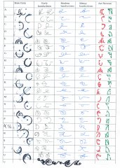
My take on Era 2-esque Scadrian handwriting (part 1 / 2 and a bit)
LordOfCheesecakes commented on Eri's gallery image in General Art
 Ooh, I love these! Great job! I love the art nouveau style letters as well, makes me want to see art nouveau style Mistborn art (which I think could be lovely, with flowing mistcloak tassels and all that. I might give it a try myself this weekend.) And the handwriting looks Mistborny (is that a word?), pretty, and practical! I love your sysyematic approach as well. So yeah, great work!
 -
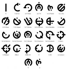
I tried redesigning the Allomantic symbols for the basic metals for Space Age Mistborn
LordOfCheesecakes commented on LordOfCheesecakes's gallery image in Mistborn Art
.png.9519457789b03c1be7a3e76a5c5f6c8d.png) I might do some more symbols/metals in this style, and I definitely plan on doing some more Allomantic typefaces. I may also give the handwriting a shot, it looks interesting. As for turning it into an OTF file, I did some googling, and it doesn't seem to difficult. I'll look into it.
I might do some more symbols/metals in this style, and I definitely plan on doing some more Allomantic typefaces. I may also give the handwriting a shot, it looks interesting. As for turning it into an OTF file, I did some googling, and it doesn't seem to difficult. I'll look into it.
.thumb.png.6056b77a6e99297c7a9da2c39059658b.png)


.png.9519457789b03c1be7a3e76a5c5f6c8d.png)