

Evie
-
Posts
89 -
Joined
-
Last visited
Content Type
Profiles
News
Forums
Blogs
Gallery
Events
Everything posted by Evie
-
Sorry. I havnt posted in a bbc forum in a hot minute, so im having trouble getting used to it. Graulas posed a pdf of the rules. I'm designing the cards to be printed on wood for a universe accurate gift for my husband, but i would be very pleased if someone else used my design to play. Im planning to post the pdfs with regular boring non alethi numbers of after im done so if anybody wants them they can have them. I dont know the state of anyone else in this thread or the state of the official card game, if it was ever given official rules or ever passed onto brandon. Ive tried to contact the posters in this thread, but i havnt heard anything back. I would really really like to talk to them. The thread im using to keep track and to share my progress is just me essentially talking to myself. Should i post my progress here instead? I don't know. I just draw stuff. I just did a redesign again ( these are just sketches. I threw out everything this morning) to make it more cosmere and less "herdazian" Card back is stormlight archive emblem with oathbringer because Dalinar is bestest and oathbringer is iconic and fun to draw. For the card fronts (this one is squire) i have a calligraphic version of the glyph, and some spears around the (alethi) numerals because Kaladin deserves a little shout out for all his hard work.
-

Supremacy- a Rosharan cardgame FINISHED(free pdfs available)
Evie replied to Evie's topic in Sanderson Fan Works
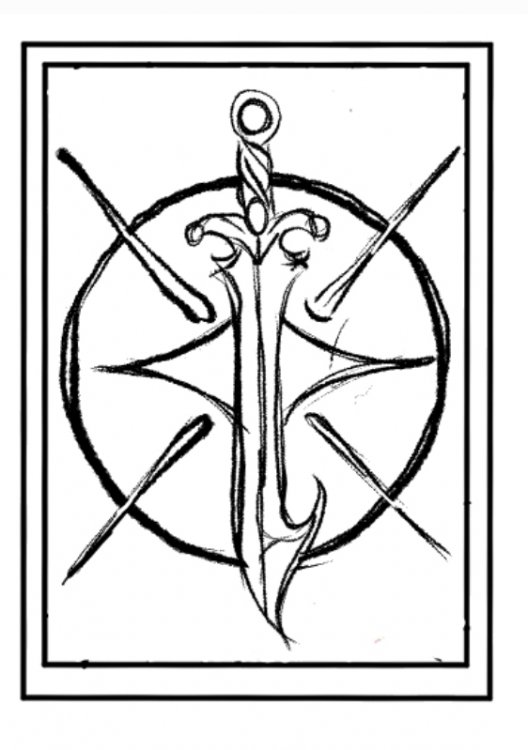
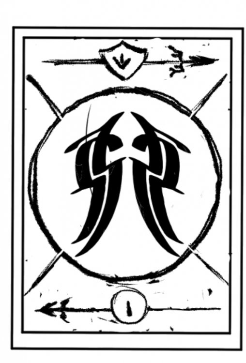
Total redesign. Less trying to make it "herdazian" and more "stormlight archive" I snooped around dragonsteel's products and used their oathbringer necklace as a base to redesign the sword. Its not exact, but its nuch more elegant. I dropped the shield and made the back into the stormlight archive symbol itself. I totally redesigned the front and made it slightly reminiscent of the cosmere symbol. I tossed the "painted" look and redid the glyph to me calligraphic. I moved the numbers from rhe corners to the top and added spears as decorative elements. This design is more simple, more streamlined and more appropriate. This means im going to have to go back to the drawing board with coloration but thats okay. Just part of the design process. Do the decks really need to be different colors? Can I get away with just printing them in one color? Ps. Husband knows im up to a largish project for his birthday. I asked him what my budget should be, and he told me 50$. Whoops. Ive been sneakily calling it my secret project because of course I have been. The other day he made the comment that its exactly what brando called his project for his wife. Oh really? What an incredible coincidence. Not intentional at all. Nope.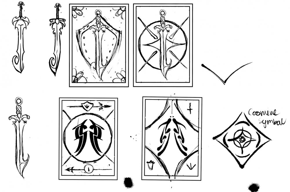
-
Supremacy- a Rosharan cardgame FINISHED(free pdfs available)
Evie replied to Evie's topic in Sanderson Fan Works
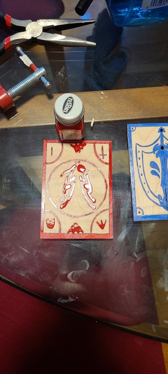
Im back with more art supplies an a headache. i got the testors open. Ive always had trouble but i got it open with a vice and some pliers. Its very hard to open with one hand in a sleeve. short story: was not worth the struggle. It bleeds and im not good with it. Maybe if it was just decorative elements it would work, but absolutely not as a main color. Moving on. Fully coloring using my new fine lined paint pens. Looks okay. Is very tedious. Very, very tedious. I would dearly not like to do this for two faces of two entire decks. I am not a herdazian craftswoman being paid big spheres for this. Next is just coloring the details, trying out with the new paint pens. Tried multicolored and one color. Im not happy with multicolored. In fact I hate it. You may notice (or you may not) that there is another back design. Im liking it better. Its far more simple and has a greater contrast to the fronts. I also really like the oathbringer motif. Both the glyph and oathbringer made the design too busy, but Indont think I mind it being the sword without the glyph. I think ill stylize oathbringer a bit more and make it's hook more visable. Im considering adding more color in general to the backs. Ultimately i prefer the cards with colored details to differentiate the decks as opposed to the full color. The full color is very tedious, and if absolutely had to make them full color I would just have the company print them like that for me. It depends on how much I would like to spend on this endeavor. The minimum for printed sheets is 10, and since the cards require a minimum of two a4s thats over 100$ So thats 10 decks, which is 5 sets of playable pairs. Making two different colored decks would double that, and be up to 250$. I wish I had the money to just throw around. Right now my favorite is still the iridescent color but blue is still the most delightfully alethi. L So soft final design decision is top as the back, right as the style of the front. Thats all from Evie today.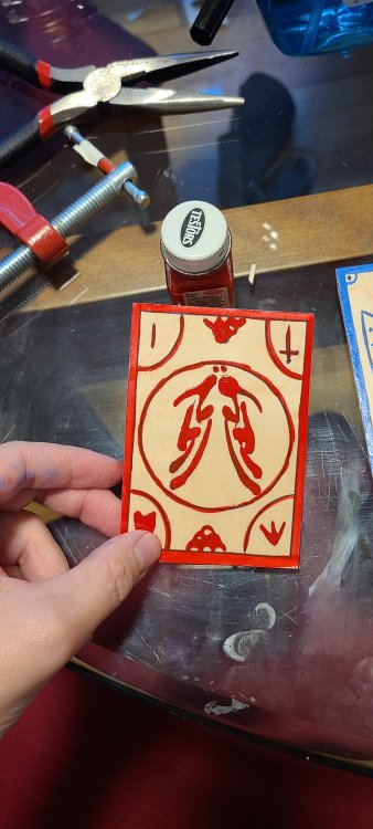
-
Big question: in a muppets version of the stormlight archives, who would be the sole human character and who would play them?
-
Supremacy- a Rosharan cardgame FINISHED(free pdfs available)
Evie replied to Evie's topic in Sanderson Fan Works
I agree. Its richer without being too dark. One could sit here and imagine what the most appropriate in universe tone and grain would be, but other than giving me something more to fret about, that wont matter one bit. XD -
Supremacy- a Rosharan cardgame FINISHED(free pdfs available)
Evie replied to Evie's topic in Sanderson Fan Works
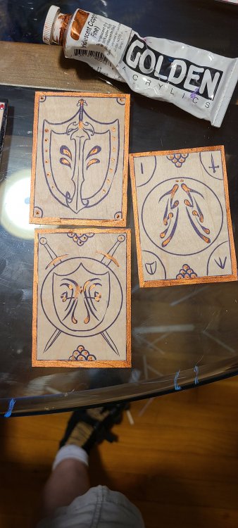
Im still going. Tried out coloring all the markings in the paint pen and the golden paint Conclusion: Im digging the fully colored glyphs. Especially in blue. It feels very alethi. I will need a finer tipped paint marker because alot of details are lost. Its also less opaque than I realized. Either way, the back will need to be redesigned to be more simple. The iridescent paint is a bit ... Too much covering the whole card. Its better as a detail. I like it against the black but not so much against that blue. Maybe if I got a silver, or made the base paint red. So more experiments needed. Im out of things to test today without getting more supplies though.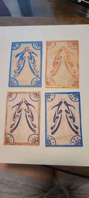
-
IVE GOT PROTOTYPES.
Please dont mind my safehand.
(ಥ﹏ಥ)

-
Supremacy- a Rosharan cardgame FINISHED(free pdfs available)
Evie replied to Evie's topic in Sanderson Fan Works
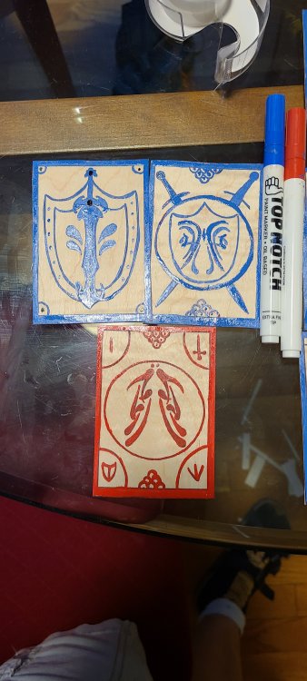
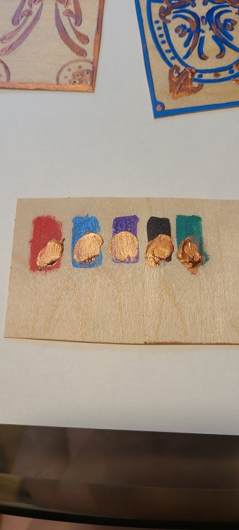
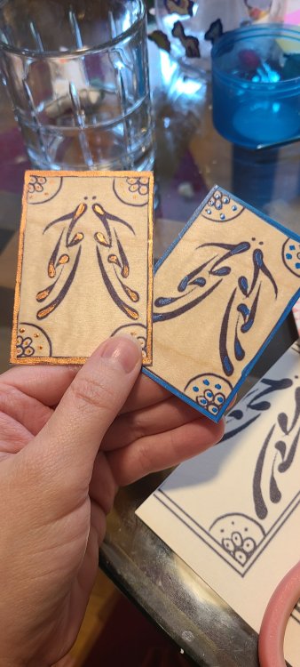
*vibrating* We have PROTOTYPES I did a print test. The veneer pages do indeed go through my printer! But only against the wood grain. I tested 4 varieties of paint. I found my testers enamel but i couldnt get them open T-T Here are the paints I tested today: Folk art acrylic: cheap end acrylic commonly used for crafting. Bad opacity, flow was okay. I wasn't impressed. Liquidex heavy body: a middle grade acrylic I used often in college for its affordability. im underwhelmed. Its not opaque enough, and it doesnt flow well enough , so the lines are choppy. I tried this partially: But i didnt like the look of it. I might try again with other paints later. Tulip paint marker: Its a paint marker. The opacity was excellent and it was the easiest to apply of all of the paints I tried today. This is a contender for my final decision. Ill get a finer tip to see if I can use shortcakes suggestion. Golden iridescent copper acrylic: one of the higher end brands. Excellent flow and opacity. Im in love. I cant even describe how excessive and extra the iridescence is, and im very tempted to use it. Its glorious. Im going to make some more wood cards and try shortcakes suggestion , but as it is its elegant, excessive, and Im in love. I worry that doing the entire linework in this color would make it difficult to read. Still worth a try. Conclusion: I'll use either golden or the acrylic paint marker. Cards should ve printed against the grain. More testing needed. Time to cut them out. Please dont be too scandalized by my exposed safehand. Consider it a sexy reward for reading to this point. AGHDJEBS I LOVE THEM SO MUCH. They feel just right, sturdy but not too hard as to make them unmanageable as playing cards. They are small, so I might size them up but I do like them this size. It makes them feel delicate and precious. I still need to see what varnishing does to them. The goal afterall is to make them Storm proof. I might do more work on this project today, or I might not. Dear husband went into the office today, and my plans for the day fell through, so ive got some alone time. I honestly cant believe how well this project is proceeding.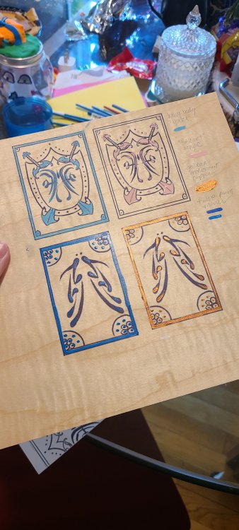
-
Supremacy- a Rosharan cardgame FINISHED(free pdfs available)
Evie replied to Evie's topic in Sanderson Fan Works
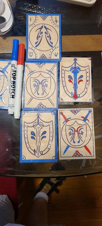
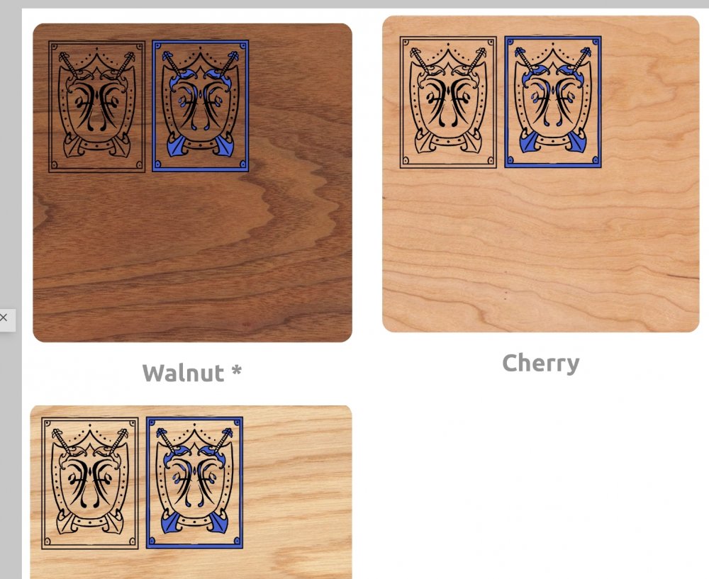
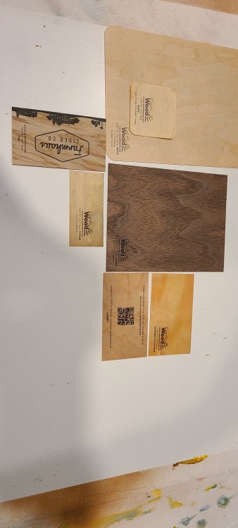
Okay here today's labors. More fooling around with the card back. Im liking bottom right, and I think ill fiddle with the front designs to match it better with less decorative elements. Nextly im comparing the images against the different wood swatches. Like I thought, walnut is too dark. Im leaning towards cherry. What do you guys think?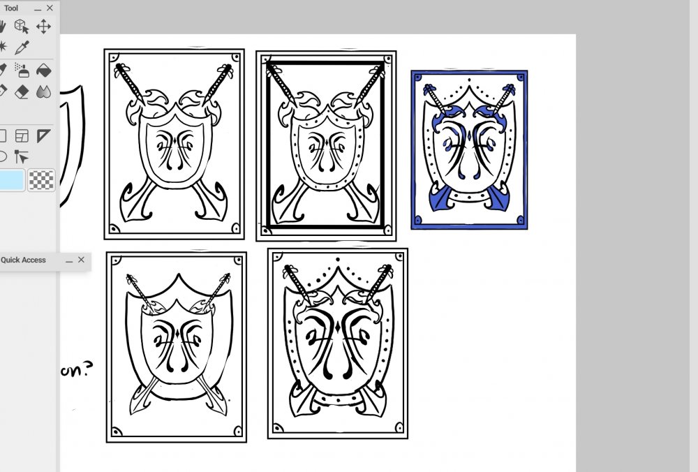
-
Supremacy- a Rosharan cardgame FINISHED(free pdfs available)
Evie replied to Evie's topic in Sanderson Fan Works
Thank you!! Ill test that out, im just concerned about keeping it consistent within each card. Ill see if my printer can handle one of the veneer sheets to test it out, if not ill have figure out the best way to transfer it lol. Have either of you got any input on the design? -
Supremacy- a Rosharan cardgame FINISHED(free pdfs available)
Evie replied to Evie's topic in Sanderson Fan Works
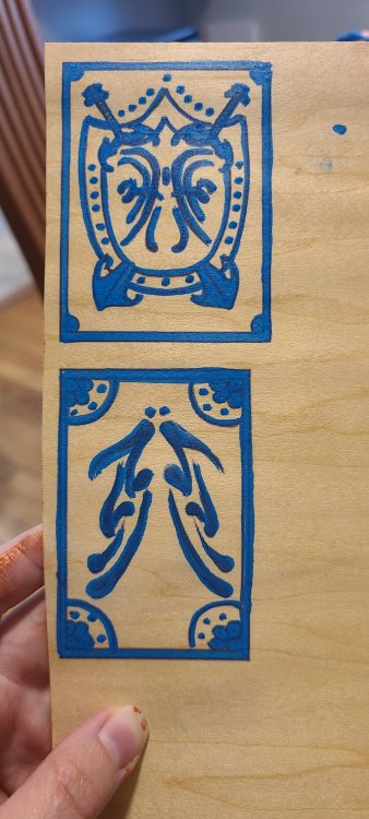
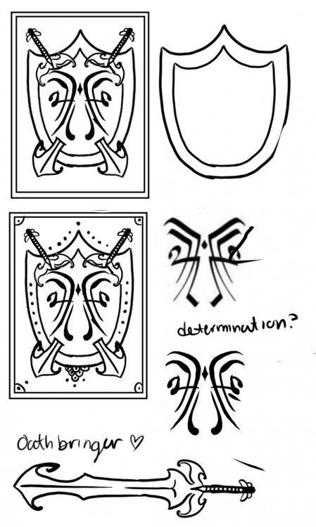
Doing some more designing of the cards Played around with numbers and decorative elements. Flirted with using a drawing but i didnt like it. I did some designing of the card backs too and im liking the direction its going but im not 100% . I chose the glyph "determination" for the back, because out of the known glyphs on yhe wiki I felt like it was the best for the name of a card game. Im fond of it and I think im definitely going to use that glyph. I used a sword styled after oathbringer as a decorative element instead of a standard sword. Im still playing with the level and style of decorational elements, but im happy with the rough outline.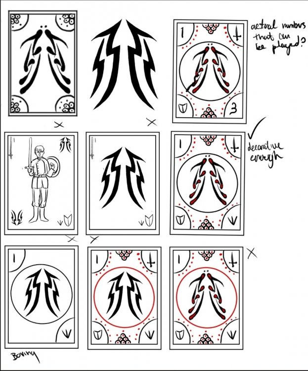
-
Tjank you, friend
-
You are doing excellent. I notice the erased guide lines, and finding shapes as a base for your characters is exactly what you should be doing.
-
Supremacy- a Rosharan cardgame FINISHED(free pdfs available)
Evie replied to Evie's topic in Sanderson Fan Works
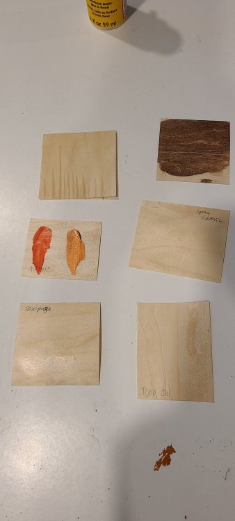
Veneer printing samples came today and Im wasting no time testing them. The quality is very good and im very pleased. Its pliable but more heavy duty than card stock. It has a wonderful wood smell and the printing on it looks very good. I got a variety of samples in different woods. My favorites are oak, cherry and walnut. I like walnut the best but am concerned it is too dark for the card information to show up. I did some testing with different materials. My goal is for them to be shiny and match the box. heres my tests. Cutting was very successful. It was fairly easy to cut with scissors or craft knife, even against the grain. Waterproof: bad. It warped badly. Pretty much what I expected. Waterproofing on a printed piece was promising in that the ink did not run, even if I scratched at it so it will hold onto any varnish no problem. Staining: okay. Took the stain well, but slightly warped. I will not use the stain, but instead match the stain of the box to the cards. Acrylic paint: good. The medium. The wood did not warp. Looks okay I was displeased to find that my enamel paints were dried up. Ill have to get ahold of some to test. Spray varnish: okay. Low shine. Didnt warp the wood but didnt give the effect I wanted. A good backup option if future tests fail. Modpodge: bad. Wood warped. Didnt expect much from it anyway. Tung oil: meh. Not the effect I wanted. Shiny, but not very much so. These were the materials I had on hand. I will be buying some wood varnish and some enamel paint to test next. Conclusion: Im pleased with the material, and will be going forth with having the company print the cards. My plan is still to have single a4 sheets in one color printed, then add details in paint and cut them myself to keep the costs from being too absurd. Im abandoning the idea of staining entirely. It would cause too much pointless warping when I can just pick a nice color of the woods available. Next step is to design the cards. I dearly hope I can get in contact with the gentlemen who designed the game. If any of you are reading this, kindly DM me. I would love your blessings on this project, but if I dont get them Im continuing on anyway. This is afterall, a personal project not intended for sale etc.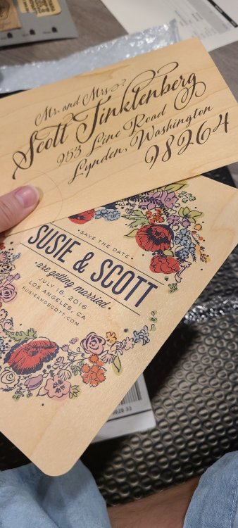
-
Cant. I lost my hands and can no longer type
-
I believe I deserve a medal for reading all of this. But honestly, I agree on many of the best girls and adoptables here, at least out of the ones I have read/seen etc etc. Its my solomn oppinion that you can have as many waifus as you want but you can only have one Best Girl period. The best waifu in any given media is not Best Girl, but merely a waifu. Other categories exist but only one Best Girl can reside in your heart at one time. Mind you, I speak from the position of a grown married woman who happily indulges her terminally weeb husband. I can look at this academically. I share my bedroom with no less than 3 dakimakura of my husband's waifus (a 4th stays on the floor in the corner, but i suppose Darkness ((konosuba)) would prefer that anyway.) Rem is especially a popular and solid waifu and I like her alot as a character and is my husbands long time best girl. In addition to a daki she also exists as a tiddy mousepad in our home. Emilia I dont like in general. I dont like her character. I dont like her background. I dont like her goals. I dont understand the obsession over her. Shes currently out of favor with my husband as well, and lives at the end of the bed. Current best girl seems to be Yor from spyxfamily, but Im not sure whether its because she has overtaken Rem or that she is just more comfortable. Husband has been looking at a kayak rack to store the unused waifus. Moving on, I would like to propose "Baby" and "Good girl" instead of Moe or girl I would like to adopt. Good girl being a class lower than Best Girl, without the additive of attraction that is inherent with waifu, and Baby being a shorter and easier way to refer to the feeling of "i want to adopt you and protect you from all harm" Klee is baby. Anya is baby. Vin is baby. Syl is Very Good Girl. Ganyu is Very Good Girl. .... That being said Best Girl is Genshin's Noelle and I will die on that hill.
-
I feel so out of my league here. Im still trying to catch up on the latest cosmere books, and there is so...... SO much brandy sandy. I STILL havnt finished Rhythm because I had a major life crisis and just couldnt function with more emotions, then I completely forgot what was going on, so I tried to start it over but its so long and he KEEPS COMING OUT WITH MORE BOOKS So im like, let me just get current with his other stuff before I try to finish stormlight BUT THERE IS ALWAYS MORE STUFF Which is incredible, but STORMIT does this man even sleep?
-
Supremacy- a Rosharan cardgame FINISHED(free pdfs available)
Evie replied to Evie's topic in Sanderson Fan Works
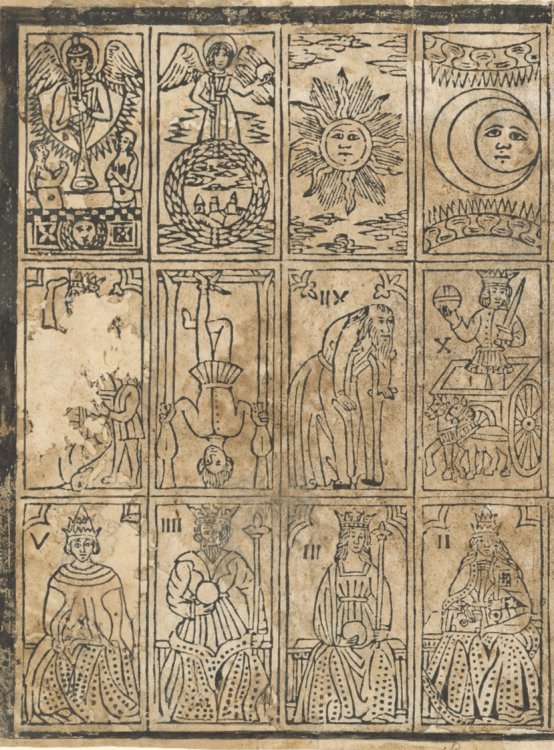
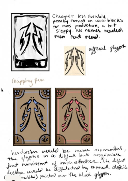
Heres some concept designs. Since this is an item rather than a playable game, i think I can take some liberties to make it make more sense in universe. The two most noticable things im thinking of is removing all english. The game would need to be accessible to men, so actual writing would be unnecessary. The glyphs themselves would inform the player of the card. The second decision in the second model is that I didn't include the sword and shield, only the number. A player who spends the money on a fancy set will know what number is which on a simple game like this. So what have i got here. The first image of a rough looking thing is the concept of a cheap set. Mass production is obviously not a thing, so reproduction would be done with wood cuts or something similar. In wood cuts, what you cut away is white, and what you dont remains black. For smaller details like the numbers at the bottom, i imagine an artisan would chose to leave that area black and cut the numbers in. The print is rough and messy, but this one is a cheap deck. I will not be making a set of wood cuts. I dont hate myself that much. printed playing cards , italy 15th century Then at the bottom I have the herdazian concept. I made the glyph in a different "font" reminiscent of the confident brush strokes you find in folk art or calligraphy. Unlike the cheap set these would been to be painted on. The difference in the players decks would come from additional colored details. The decoration on the back of the card would have a similar font. My plan is becoming more coherent now. *Make the files with each card, *have the company print them double sided on the veneer. *Cut the cards to size *Stain them to match the box *Add enamel decorations in two tones to differentiate the different decks. Now how to keep the decks seperate? Maybe divide the box into compartments? Or make little bags for the decks? Maybe out of the felt lining remnants. I could embroider the game glyph on it, but I dont wanna. And I should probably have a playable version and a rulebook included, because this bastard is going to want to play it. Bad handwriting transcript: (Beside the first image: Cheaper, less durable possibly carved on woodblocks for mass production a bit sloppy, no names needed. Men cant read . Official glyph Herdazian would be more ornamental. Glyphs in a different but recognizable font reminiscent of brush strokes. The different decks would be differentiated by enamel details (the red and blue) painted over the black glyphs. ) Making progress here.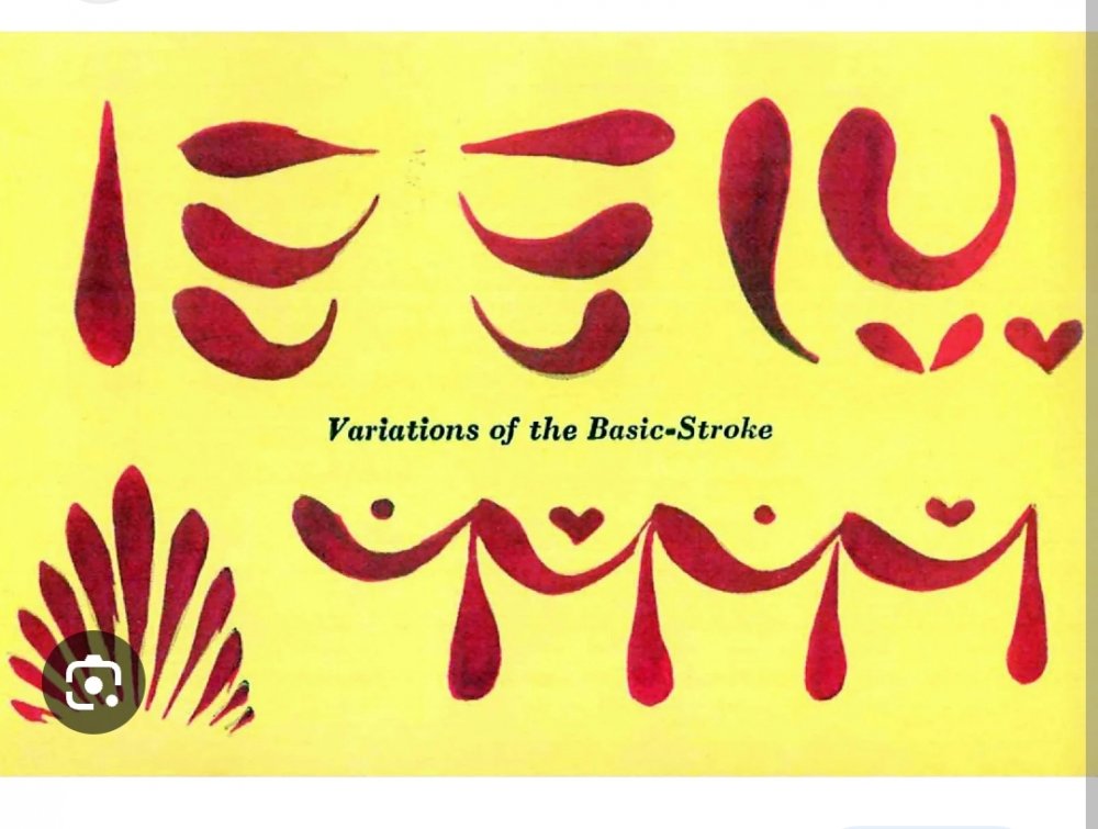
-
Supremacy- a Rosharan cardgame FINISHED(free pdfs available)
Evie replied to Evie's topic in Sanderson Fan Works
Wow that was fast. So 106 ish plus shipping. Ill have to wait until next month to order them but awesome Ill get the designs ready in the meantime.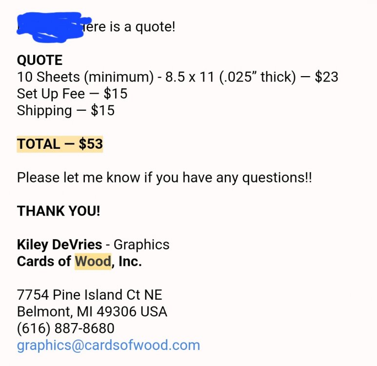
-
Ive seen the numerals in the wikis section on glyphs, but I dont understand them well. Is there a standard for what the numbers beyond 10 look like?
-
Im still getting used to how this works.
-
Much MUCH older. Tpbm has at least 3 houseplants
-
Only as scary as they are designed to be? At least not as scary as fear spren.


