
Critterweaver
-
Posts
7 -
Joined
-
Last visited
Critterweaver's Achievements
17
Reputation
-
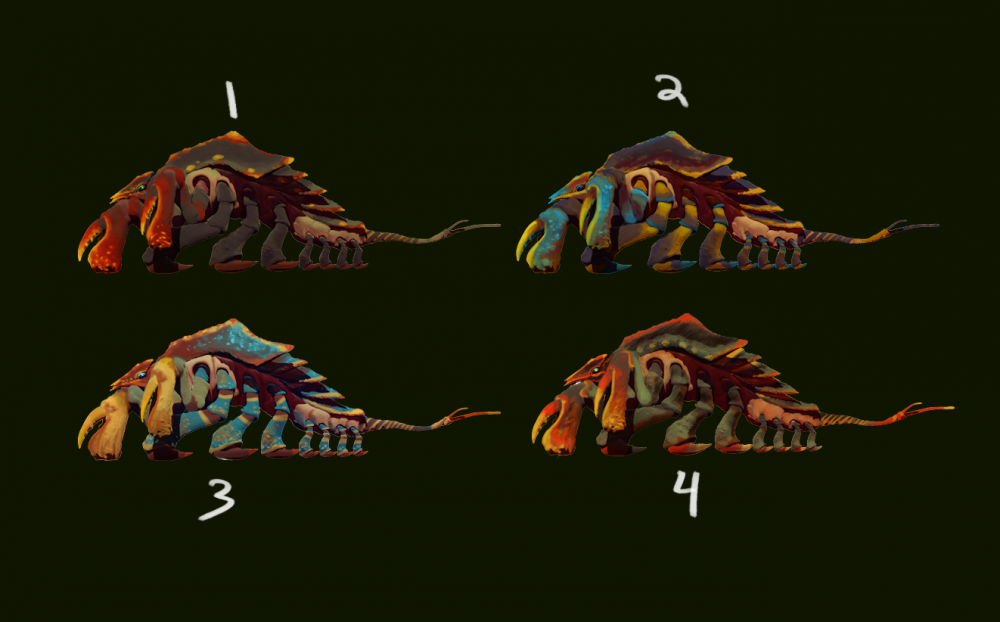
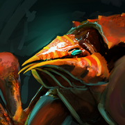
Thanks everyone for your comments. I think I'm going to go with one of the red/green variants. @Kingsdaughter613 is right, in the ocean as you get further and further down reds and darker greens change to more neutral values, making them harder to see. That's why a lot of deep sea life is colored bright red. Here's a great video demonstrating the effect (Youtube Link). I do like the bluer colors, but I might save those for the (book 2 spoiler) Now the chasms aren't underwater most of the time, but a similar coloration would be helpful in the darkness. Also @Fullborn you totally picked up on the glossiness problem. At the time I was tinkering with the shader and didn't have the glossiness how I liked it, so I ended up changing it to the more muted texture of the other renders. That's something I'm going to have right when I do my final renders with the updated texture. Thanks for the feedback everyone, I'll post soon with an updated beast. :- ) -Critterweaver
-
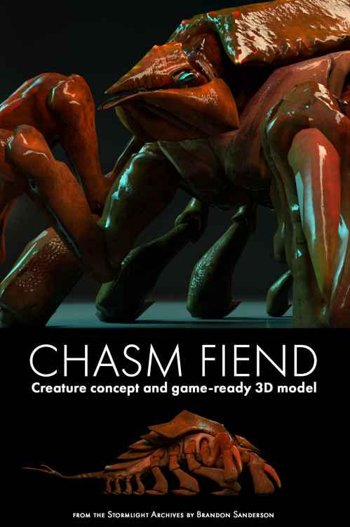
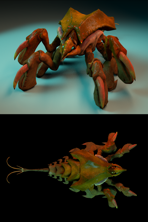
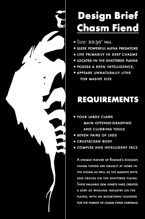
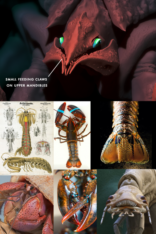
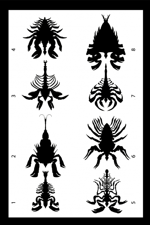
Hello everyone. I'm a concept artist inspired by the Stormlight Archives. Since I love creature design, I decided to work on a Chasm Fiend for a portfolio project. Currently I have the 3D model finalized and ready to be textured (given color) but I wanted some feedback on a potential color scheme. So far I've been looking at marine life for inspiration, since I want my Chasm Fiend to be more than a dull grey or stony color. This may be less accurate, but I think it will help mine stand out a bit. Please look at the images below and let me know what you think! Thanks! -Critterweaver P.S. I've also included some graphics showing my progress, as well as a first pass on a textured game-ready 3D model. Feel free to comment on that as well.
-
Concept Artist looking for feedback
Critterweaver replied to Critterweaver's topic in Introduce Yourself!
No worries Chaos, I understand that keeping the forums clean means jumping through some hoops and I’m glad to do so. :- ) Thanks for the heads-up Kidpen, and for the interest in my work. I haven’t done much on forums before so I appreciate the advice. And thanks Calderis! My reception here has been very friendly so far, I’m very glad for Zahelofthewiki’s recommendation to join you all. UPDATE: If you'd like to look at my concepts I've made a post on the fan creations forum here -
Concept Artist looking for feedback
Critterweaver replied to Critterweaver's topic in Introduce Yourself!
Comrade Zahel, I feel very welcomed! Your recommendation was a good one. Bookish Ocelot has already done plenty to make this cosmernaut feel at home. -
Critterweaver changed their profile photo
-
Concept Artist looking for feedback
Critterweaver replied to Critterweaver's topic in Introduce Yourself!
Thanks for the warning! Quick question: do you know how many posts a man must make before he can post image links? That's really the main reason I'm here so I need to know how many quality posts I have to think up before I can start getting feedback on my work. I just heard from a friend who uses this forum that I can make a post requesting a lift of the posting ban, so I'm going to try that. -
Hi everyone! I'm a concept artist who's done some work on a chasm fiend. I'm currently trying to get a few posts in so I can link images and such for you all to look at. If this is the kind of thing that interests you I've put some work on Reddit and my professional instagram so let me know and I can PM you links to those. As soon as I pass my trial period I'll be posting in the fanworks section, so keep an eye out there. Journey before destination, -Critterweaver.


