TheKingofCrimsonesia
-
Posts
10 -
Joined
-
Last visited
Content Type
Profiles
News
Forums
Blogs
Gallery
Events
Everything posted by TheKingofCrimsonesia
-

I am, unfortunately, the Hero of Ages (Alloy of Law era Steel Alphabet font)
TheKingofCrimsonesia commented on TheKingofCrimsonesia's gallery image in Mistborn Art
 Aw, thanks!
 -
Fonts for the various scripts of Scadrial.
-
-
I am, unfortunately, the Hero of Ages (Alloy of Law era Steel Alphabet font)
TheKingofCrimsonesia posted a gallery image in Mistborn Art
From the album: ScadrianScripts
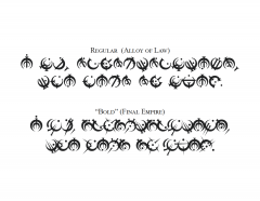
AlloyofLaw.otf, AlloyofLaw Bold.otf (or, if you prefer TrueType: AlloyofLaw.ttf, AlloyofLaw Bold.ttf) AlloyofLaw_README.txt, AlloyofLaw_Bold_README.txt This image shows the quote "I am, unfortunately, the Hero of Ages", the first line of the Words of Founding, in two different font styles. The first uses the "print" style allomantic symbols from the Alloy of Law (Era 2 Mistborn), while the second uses the older style symbols from the Final Empire (Era 1 Mistborn). These are both referred to as the Steel Alphabet, or the Allomantic Alphabet. Attached above are the font files I used to make this image - I've implemented it as a single font named "AlloyofLaw", with the Era 2 symbols as the default "Regular" style and the Era 1 symbols as the "Bold" style. Once both files are installed, switching between the styles is as simple as bolding and unbolding the text! The Words of Founding were presumably originally written in the old Era 1 steel alphabet symbols. Reprinted, abridged copies of this text are mentioned in the Era 2 novels. I imagine there exist many different versions which have been published at different points Post-Catacendre; some probably use the old symbols for an "old-fashioned" feel, while others probably use the modern symbols. This is what I envisioned when creating these fonts - two different font styles using the Alloy of Law era alphabet conventions. I hope you enjoy! More details: The page for the Badali jewelry customizable steel alphabet ring gives a complete transliteration of these symbols to the Latin alphabet; Isaac Stewart has stated "From the beginning, I built the symbols to also be an alphabet. ... The rings are the first chance to use it." Peter Ahlstrom has also mentioned "The alphabet used in Alloy of Law is just a different font of the same alphabet as used in the Final Empire." My take on the very slight differences between this transliteration and those in Ben McSweeney's Inquisitor artwork from Mistborn Adventure Game (transliteration by Valkynphyre here) is that the Inquisitor transliteration is from an older religious text from pre-Era 1 Mistborn, while the Badali transliteration is accurate for the alphabet during Era 1 and Era 2. My fonts here use the Badali transliteration; I've made a different font for the Inquisitor transliteration style. One slight difference between my "Bold" font (which uses the Era 1 symbols with the Badali transliteration) and the steel alphabet as used in Era 1 is using a moved dot to differentiate between the vowels I and E, and O and U. Isaac Stewart mentions and Peter Ahlstrom elaborates on how this is a recent innovation as of the Alloy of Law. These fonts contain two lookup tables: liga - four subtables to: (1) - substitute the name of a metal or a direction for its corresponding symbol (must be spelled in allcaps: IRON, STEEL, TIN, PEWTER, ZINC, BRASS, COPPER, BRONZE, CADMIUM, BENDALLOY, GOLD, ELECTRUM, CHROMIUM, NICROSIL, ALUMINUM, ALUMINIUM, DURALUMIN, DURALUMINIUM, ATIUM, MALATIUM, LERASIUM, ETTMETAL, HARMONIUM, WEST, NORTHWEST, NORTH, NORTHEAST, EAST, SOUTHEAST, SOUTH, SOUTHWEST) (2) - display any double letters as a single letter (3) - display the numbers 10, 11, 12, 13, 14, 15, 16, 256, and 4096 as the corresponding symbol. kern - pairwise class-based kerning values The 24 basic symbols were downloaded from the Coppermind wiki in SVG format - these SVGs were created by user Paleo (from Isaac Stewart's original artwork). I created the punctuation included in these fonts by extrapolating from the period and comma that appear in Ben McSweeney's Inquisitor artwork. If using MS Word, once you create a new document, type some text, and set the font to "AlloyofLaw," you must also highlight the text, expand Word's "Font" section at the top (or press Ctrl+D), and navigate to the "Advanced" tab. Here you must select the checkbox "Kerning for fonts" under the "Character Spacing" section. Under the "OpenType Features" section select "all" from the drop-down menu labeled "Ligatures," and select the checkbox "Use Contextual Alternates." I wish Word didn't make this so convoluted. If you want to mess around with these fonts in FontForge, here are the SFD files: AlloyofLaw.sfd, AlloyofLaw Bold.sfd© The Steel Alphabet symbols are copyright of Brandon Sanderson and Dragonsteel Entertainment. In compliance with fanart policy, these fonts cannot be used for commercial purposes.
-
Hello, would you like to destroy some evil today? (Warbreaker font)
TheKingofCrimsonesia commented on TheKingofCrimsonesia's gallery image in Warbreaker Art
 Feel free! Just keep the readme file with it
 -
Super cool! I noticed another minor mention in the Mistborn Adventure Game - on pg. 264, in the steel inquisitor artwork that prefaces the chapter "Treatise Metallurgic," there's a line set by itself in the middle of the page that reads: "Though you strike out their eyes, they shall see the hearts of men." (here's the full translation of all the text)
-
They Shall See the Hearts of Men (Steel Alphabet Font)
TheKingofCrimsonesia posted a gallery image in Mistborn Art
From the album: ScadrianScripts
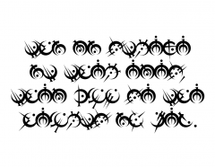
SteelAlphabet Inquisition.otf SteelAlphabet Inquisition.ttf SteelAlphabet Inquisition README.txt This image is the quote "Though You Strike Out Their Eyes, They Shall See the Hearts of Men" created using the above font, which is a version of the Steel Alphabet of Scadrial (The quote is from artwork by Ben McSweeney). The script is in a style used by the Canton of Inquisition during the Final Empire (though this particular writing style may not be strictly cosmere-canon, as it comes from the Mistborn Adventure Game). A wealth of information on the Steel Alphabet can be found at the Coppermind here. I was inspired to make this font after first encountering this fabulous font created by 17thShard user Claincy. If you prefer their font, then by all means use it! It is very similar to mine. So why did I make this font? Well, BenMcSweeney (Inkthinker) created this fantastic piece of artwork for the Mistborn Adventure Game, and as you can see, the script runs together much more closely than in Claincy's font (you can see the translation decoded by user Valkynphyre in this post). The overall feel is that of an illustrated manuscript that's probably been around for quite some time, which is the main reason I suspect the style to be archaic as of the events of Mistborn. Anyway, consider my font just a stylistic variant - "Inquisition" style as opposed to the "Final Empire" style of Claincy's. Note: internally, my font is named "SteelAlphabet" with the "Inquisition" font style sublabel. Claincy's font shares the same name but has the "Aligned" font style sublabel. When both fonts are installed, they will be categorized as different styles of the same font (the same way bold or italics work). In a document editor like MS Word or LibreOffice Writer, only one entry for "SteelAlphabet" shows up in the list of fonts, and "Inquisition" or "Aligned" can then be selected for the font style. The font style selection is normally accessed in a popout window. In Word, this is the advanced font options menu available at the bottom right of the "Font" section of the top toolbar (or with the hotkey Ctrl+D). In Writer, this is accessed by opening the "Format" drop-down menu from the top toolbar, then selecting "Character." Technical Details: The basic letter assignments are those shown on the Coppermind page linked above, with the following modifications. In the process of transliterating the text of McSweeney's Inquisitor artwork, I noticed the following spelling rules, which are automatically applied by the font: -O and U are undifferentiated; both are Pewter -E and I are undifferentiated; both are Tin -Doubled letters are reduced to a single glyph (both consonants and vowels) -EI and IE are replaced by one Tin glyph (counts as double letter) -OU and OUGH (silent GH) are replaced by one Pewter glyph (counts as double letter) -The name of a metal is replaced by its glyph (preferably an illustrated drop-capital, but I don't have the artistic skill to create these, sadly) -Hard C is replaced by K -Soft C is replaced by S (the one instance of C/CH for soft C is probably a typo) -Hard CH is replaced by K, but soft CH is a distinct glyph -SH is a usually a distinct glyph (the one instance of SH as two glyphs is probably a typo) -PH is replaced by F This font contains four lookup tables: calt (1) - substitutes S for soft C liga - four subtables to: (1) - substitute THO for THOUGH (2) - substitute the name of a metal or a direction for its corresponding symbol (must be spelled in allcaps: IRON, STEEL, TIN, PEWTER, ZINC, BRASS, COPPER, BRONZE, CADMIUM, BENDALLOY, GOLD, ELECTRUM, CHROMIUM, NICROSIL, ALUMINUM, ALUMINIUM, DURALUMIN, DURALUMINIUM, ATIUM, MALATIUM, LERASIUM, ETTMETAL, HARMONIUM, WEST, NORTHWEST, NORTH, NORTHEAST, EAST, SOUTHEAST, SOUTH, SOUTHWEST) (3) - display any double letters as a single letter (I and E are the same, O and U, are the same, CK becomes K, PH becomes F, CH becomes Tesh, SH becomes Esh) (4) - display the numbers 10, 11, 12, 13, 14, 15, 16, 256, and 4096 as the corresponding symbol. calt (2) - substitutes K for hard CH kern - pairwise class-based kerning values The mapping of the Steel Alphabet symbols to Latin was decoded by 17thShard user Valkynphyre. The 24 basic symbols were downloaded from the Coppermind wiki in SVG format - these SVGs were created by user Paleo. In Ben McSweeney's Inquisitor artwork, a period and a comma appear. These were recreated by me, and used as inspiration for the rest of the punctuation included in this font. Additionally, the Kredik Shaw symbol was recreated by me from its appearance in McSweeney's Inquisitor piece. The kerning values in the font are designed to mimic those in that same artwork. The standard Allomantic symbols are assigned to the standard Latin alphabet (abcdefghijklmnopqrstuvwxyz). Harmony's symbol is assigned to & (no reason besides its use here), while the Kredik Shaw symbol is assigned to # (completely arbitrarily). Two additional letters are present in the Steel Alphabet that do not exist in the Latin alphabet: SH and CH. SH has been assigned to the Unicode "Esh" U+0283, and CH to "Tesh" U+02A7, which are both part of the International Phonetic Alphabet Unicode range. Note than in McSweeney's artwork, the line spacing is deliberately extra narrow, such that the descenders of one line overlap with the ascenders of the line below it. This font is set up so that the glyphs extend slightly above and below the defined max and min height, in order to replicate this behavior. However, in MS Word, line spacing of "single" will automatically adjust to avoid this overlap. Setting line spacing to "exact" instead will replicate the overlap behavior - BUT Word will NOT display it! The overlap will show up when saved as a PDF or printed, but the onscreen display cuts off the overlapping portion of the letters. Other programs, such as LibreOffice Writer, should display the overlap correctly onscreen using the default single line spacing. Another small note about the artwork - the quote used for this gallery image is actually the one place in the artwork that "SH" (in "shall') is spelled with "S" and "H" instead of the special "SH" symbol. I think it's a typo? Anyway, the image I have created uses the "SH" symbol instead, so it does not exactly match McSweeney's text. If you want to play around with the font in FontForge, here is the SFD file: SteelAlphabet Inquisition.sfd -
Warbreaker Leatherbound Translation
TheKingofCrimsonesia replied to Pagerunner's topic in Warbreaker
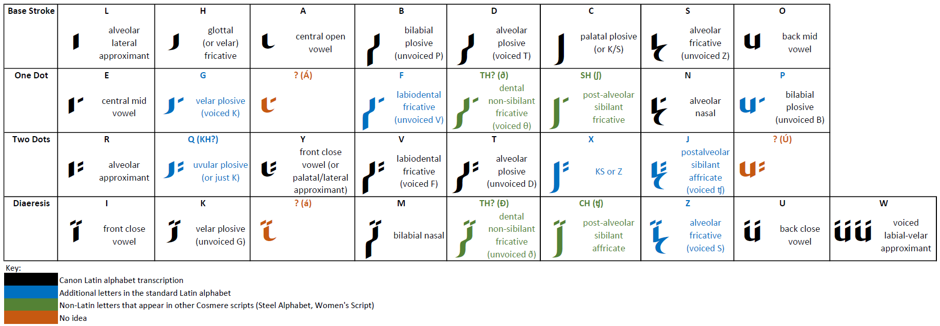
Apologies for the necro - this thread was just so interesting I had to make a font for this script: WarbreakerFont.otf I had a great time working through the IPA categorizations to take my best guess at the missing letters! Here's the theory table I made: What I see is that within each column, there are often two closely related pairs of sounds. G/Q seemed to fit well in the H/K column, since all those sounds are from the back of the throat. Either F or P seemed like it would fit equally well in the B/V/M column - I ended up putting P with O/U since those both involve similar lip shapes. If X exists anywhere, maybe it's in the C column? Z seemed like a great fit in the S/N column, rounded out with J. Single letters for SH, CH, and TH appear in other Cosmere scripts, and none of those letter combinations exist in the available text, so who knows if they exist in this alphabet? If they do, the D/T column is a natural fit for TH (both voiced and unvoiced), while SH and CH could conceivably round out the C/X column. I really have no idea what might fit in the A/Y and O/U/W categories - I'm likely waaay off! But I had fun If you want some more details about the font, I posted some in my gallery here.
-
Hello!! Excited to share my creations!
TheKingofCrimsonesia replied to TheKingofCrimsonesia's topic in Introduce Yourself!
Thanks! Fave Cosmere book? Either Elantris or Mistborn: The Final Empire, I think. My favorite character is, without contest, Navani (I'm an engineer lol, we have a lot in common). I'd probably pin my favorite non-cosmere book as Douglas Adams' Hitchhiker's Guide to the Galaxy, though I have been eagerly devouring Terry Pratchett's Discworld books recently. I love sci-fi in general! -
Glad to be here with y'all! I've been working on fonts for various cosmere scripts, and I finally finished one - a version of the script embossed on the cover of the leatherbound edition of Warbreaker. Check it out here!
-
Hello, would you like to destroy some evil today? (Warbreaker font)
TheKingofCrimsonesia posted a gallery image in Warbreaker Art
(Edit 4/16/21: spotted and fixed an error; these are the updated files) WarbreakerFont.otf WarbreakerFont.ttf WarbreakerFont_README.txt This image is simply the phrase "Hello, would you like to destroy some evil today?" rendered in the font above. I created this font using FontForge after being inspired by the fabulous discussion in this post, which transliterates the inscription on the cover of the leatherbound edition of Warbreaker. This script is not the Artisan's Script of Hallandren, since it does not use color (see this post from Isaac Stewart). I have simply called it "Nalthis" internally. If you compare this image to the leatherbound cover, you will notice a discrepancy in the word "destroy" - it appears to be spelled "deiroy" on the book, but I have spelled it normally here. See the transliteration post linked above for more details. All letters besides F, G, J, P, Q, X, and Z appear on the cover or on internal art. These missing letters were assigned by me based on trends in the IPA designations of similar glyphs and are in no way canon. I posted an image of a table showing the IPA designation of each letter in this thread. Additional unused glyphs created following the existing patterns are assigned to Unicode values: "Aacute" U+00C1 - same base stroke as A, Y "aacute" U+00E1 - same base stroke as A, Y "Eth" U+00D0 - same base stroke as D, T "eth" U+00F0 - same base stroke as D, T "Uacute" U+00DA - same base stroke as U, O "Esh" U+0283 - same base stroke as C "Tesh" U+02A7 - same base stroke as C The unused glyphs are also assigned based on IPA trends, but no automatic substitutions have been included in the font. It is possible that "th" is substituted by the "eth" character, "sh" by the "esh" character, and "ch" by the "tesh" character, but these letter combinations do not appear in the text samples mentioned above. To use this font, install your preference of the OpenType (.otf) or TrueType (.ttf) font file. If using MS Word, once you create a new document, type some text, and set the font to "Nalthis," you must also highlight the text, expand Word's "Font" section at the top (or press Ctrl+D), and navigate to the "Advanced" tab. Here you must select the checkbox "Kerning for fonts" under the "Character Spacing" section, and under the "OpenType Features" section select "all" from the drop-down menu labeled "Ligatures." Blame Microsoft for the convoluted method of enabling these features; I have heard that other programs do a better job. If you use a different text editor, search for information on "enabling advanced typography features" or "enabling ligatures and kerning" for your program of preference. My experience is limited to Windows & Microsoft; sorry I can't be of more help If you're familiar with FontForge and want to mess around with this font, here's the SFD file: WarbreakerFont.sfd