
Leaderboard
Popular Content
Showing most liked content on 11/04/21 in Articles
-
 Hello everyone! We have some pretty exciting news for you today: we are going to change the logos across 17th Shard, the Coppermind, and Arcanum! These new logos are made by Raul Chaves, who we hired based off a brand identity for Allomancy that he did. We've wanted to make our logos more modern for quite a while, and I hope you'll agree that they turned out awesome: We have had the same logo for 17th Shard since 2016, the iconic glass shard with the 17 broken into pieces over it, and that 2016 logo wasn't very different from our original 2010 design. Both were made by Will Raboin (Shivertongue on the forums, but he's been out of the fandom for some time), and I have always been fond of them. But, we wanted to make the 17th Shard logo flatter and more modern. We also wanted a simpler silhouette, which has a few advantages, in particular, future merchandise possibilities. The old look was quite poor for merch as it did not work well in monochrome, and required a pretty specific color scheme to be visible. You couldn't exactly put the old logo on a dark background! Also, the wordmark (that is, the text on the logo) was a bit too complicated, with a gradient on the word "Shard." We still wanted to try and evoke some of the same feel of the old logo though, with a similar shape that also evokes a bit of shattering. Another benefit to this logo refresh was that it allowed us to start the process of unifying the design of 17th Shard, the Coppermind Wiki, and Arcanum, so that all our three sites feel more cohesive together. Now we have the common silhouette on all sites, with the same accent gold color. The Coppermind logo was... very old, and actually based off of the 2010 17th Shard logo, which had a green glowing gradient around the broken glass. Yikes, that was old. It's a huge improvement to get this updated, since realistically, even in 2010, we didn't love the Coppermind logo. We wanted to evoke a symbol from the Steel Alphabet, but also not use that icon directly. Arcanum's logo is the most recent of our three logos, coming out in 2017. This logo is my favorite of our three, and actually inspired the designs. The old logo was made by KChan--another retired staff member who was on some earlier Shardcasts, and who helped with a lot of colors on 17th Shard--who had the great idea of putting an A inside the cosmere logo. I love the Arcanum logo, but there are some problems with doing that. The cosmere symbol isn't easily scalable to a small icon, and also, having the art directly from the books in the logos would lead to issues in future merchandise. We still wanted to keep that A symbol very visible, as that's the defining feature of the current logo. One other advantage to a flatter design is that it allows us to adapt the logo to fit with various background schemes, such as a dark colored shirt vs. a light colored shirt, or an eventual "dark mode" on our websites. In particular, Arcanum will still have a solid dark color in its header, but you can still immediately recognize this as the Arcanum logo: We will be updating our logos on these sites, as well as our social media icons and Discord server icons, within the next week or so. Arcanum, in particular, will be refreshed with a green aesthetic over its current blue, as 17th Shard will have a blue theme and we want each color scheme to be distinct. Here are some screenshots of how they might look on the sites themselves (but know these are subject to change): Let us know what you think in the comments! Having our three main websites use a similar design language will really help tie them together, but the logos are just one part of that process. You can expect as things move forward that 17th Shard, the Coppermind, and Arcanum will start to have their overall designs change as well so things feel cohesive, but that's going to be a while away. Another long-term goal is to have some merchandise to sell eventually. But, in the meantime, we loved how these logos turned out so much that we want to unveil them now, and bigger redesigns will come much later. Thank you to Raul for some truly fantastic work! Every penny spent on this was well worth it.20 likes
 -
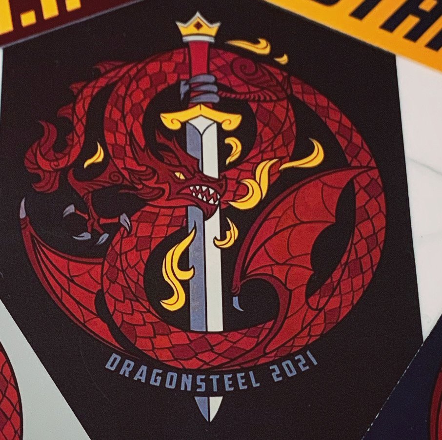 We've got some new Mini-Con news this week! Also, Brandon and some employees at Dragonsteel Entertainment will be participating in NaNoWriMo this year, and sharing their word counts multiple times a week, along with encouraging others to do the same. First, though: prewriting on Defiant is finished! This means he can start (and has started) the actual writing of the novel, which brings us to the first major piece of news. In case you haven't heard of it, National Novel Writing Month, more commonly known as NaNoWriMo, is a nonprofit organization that is most known for its eponymous annual program, encouraging authors to write a 50k word manuscript during the month of November. This year, it just so happened that the start of Defiant's writing was close to lining up with the start of the month, and so Brandon intentionally planned things out so he can participate. Around four times a week, he plans to post his wordcount for the day to r/Sanderson, with the goal of hitting as close to exactly 50k as possible, allowing him to provide an example of a constant pace to finish, as well as to encourage discussion in the comments between other writers who are attempting it. Additionally, various other members of Team Dragonsteel will be participating in this "SandoWriMo" and posting their word counts, such as Isaac (his art director), Janci Patterson (co-author of the Skyward Flight novellas), Adam (his head of publicity), Kathy (his sister-in-law and head of facilities), and Kellyn (an employee at the Dragonsteel Store). (Their usernames can be found in today's check-in post.) In other news, an updated guest list for the Dragonsteel Mini-Con has been released. Currently, the site includes (spoiler box for length): While the full event schedule is not out yet, they also announced Howard Lyon will be running a live painting session, along with Steve Argyle and Hayley Lazo. Audience participation is encouraged. The event will be at 7PM on the 22nd, in L2 Ballroom A. In a final bit of Mini-Con news, the badges have been revealed, and are by Jian Guo, cover artist of the Chinese editions: Beyond that, in order to celebrate the release of Cytonic, several new T-Shirt designs are available from the Dragonsteel store: Larger images and purchase links (hidden for length again): That's all for this week! As per usual, Brandon's Weekly Update video is on YouTube, as is this week's episode of Intentionally Blank.1 like
This leaderboard is set to Los Angeles/GMT-07:00