
")
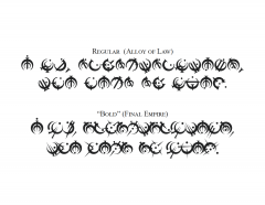
I am, unfortunately, the Hero of Ages (Alloy of Law era Steel Alphabet font)

AlloyofLaw.otf, AlloyofLaw Bold.otf (or, if you prefer TrueType: AlloyofLaw.ttf, AlloyofLaw Bold.ttf)
AlloyofLaw_README.txt, AlloyofLaw_Bold_README.txt
This image shows the quote "I am, unfortunately, the Hero of Ages", the first line of the Words of Founding, in two different font styles. The first uses the "print" style allomantic symbols from the Alloy of Law (Era 2 Mistborn), while the second uses the older style symbols from the Final Empire (Era 1 Mistborn). These are both referred to as the Steel Alphabet, or the Allomantic Alphabet.
Attached above are the font files I used to make this image - I've implemented it as a single font named "AlloyofLaw", with the Era 2 symbols as the default "Regular" style and the Era 1 symbols as the "Bold" style. Once both files are installed, switching between the styles is as simple as bolding and unbolding the text!
The Words of Founding were presumably originally written in the old Era 1 steel alphabet symbols. Reprinted, abridged copies of this text are mentioned in the Era 2 novels. I imagine there exist many different versions which have been published at different points Post-Catacendre; some probably use the old symbols for an "old-fashioned" feel, while others probably use the modern symbols. This is what I envisioned when creating these fonts - two different font styles using the Alloy of Law era alphabet conventions. I hope you enjoy!
More details:
The page for the Badali jewelry customizable steel alphabet ring gives a complete transliteration of these symbols to the Latin alphabet; Isaac Stewart has stated "From the beginning, I built the symbols to also be an alphabet. ... The rings are the first chance to use it." Peter Ahlstrom has also mentioned "The alphabet used in Alloy of Law is just a different font of the same alphabet as used in the Final Empire." My take on the very slight differences between this transliteration and those in Ben McSweeney's Inquisitor artwork from Mistborn Adventure Game (transliteration by Valkynphyre here) is that the Inquisitor transliteration is from an older religious text from pre-Era 1 Mistborn, while the Badali transliteration is accurate for the alphabet during Era 1 and Era 2. My fonts here use the Badali transliteration; I've made a different font for the Inquisitor transliteration style.
One slight difference between my "Bold" font (which uses the Era 1 symbols with the Badali transliteration) and the steel alphabet as used in Era 1 is using a moved dot to differentiate between the vowels I and E, and O and U. Isaac Stewart mentions and Peter Ahlstrom elaborates on how this is a recent innovation as of the Alloy of Law.
These fonts contain two lookup tables:
liga - four subtables to:
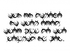
(1) - substitute the name of a metal or a direction for its corresponding symbol (must be spelled in allcaps: IRON, STEEL, TIN, PEWTER, ZINC, BRASS, COPPER, BRONZE, CADMIUM, BENDALLOY, GOLD, ELECTRUM, CHROMIUM, NICROSIL, ALUMINUM, ALUMINIUM, DURALUMIN, DURALUMINIUM, ATIUM, MALATIUM, LERASIUM, ETTMETAL, HARMONIUM, WEST, NORTHWEST, NORTH, NORTHEAST, EAST, SOUTHEAST, SOUTH, SOUTHWEST)
(2) - display any double letters as a single letter
(3) - display the numbers 10, 11, 12, 13, 14, 15, 16, 256, and 4096 as the corresponding symbol.
kern - pairwise class-based kerning values
The 24 basic symbols were downloaded from the Coppermind wiki in SVG format - these SVGs were created by user Paleo (from Isaac Stewart's original artwork). I created the punctuation included in these fonts by extrapolating from the period and comma that appear in Ben McSweeney's Inquisitor artwork.
If using MS Word, once you create a new document, type some text, and set the font to "AlloyofLaw," you must also highlight the text, expand Word's "Font" section at the top (or press Ctrl+D), and navigate to the "Advanced" tab. Here you must select the checkbox "Kerning for fonts" under the "Character Spacing" section. Under the "OpenType Features" section select "all" from the drop-down menu labeled "Ligatures," and select the checkbox "Use Contextual Alternates." I wish Word didn't make this so convoluted.
If you want to mess around with these fonts in FontForge, here are the SFD files: AlloyofLaw.sfd, AlloyofLaw Bold.sfd
Recommended Comments
Join the conversation
You can post now and register later. If you have an account, sign in now to post with your account.