

Steel Alphabet Font
Entry posted by Claincy
3102 views
I am working on multiple mistborn fan projects and I will post updates and details of them here as I go. I don't know if anyone will actually read this but I think it will be helpful to me to keep a blog of what I am doing and may help me be more consistent with the work I put in.
I currently have four mistborn projects:
-The Steel Alphabet Font (which will be the focus of this post)
-A version of Shelldry (More on that soon)
-A character generator for the Mistborn Adventure Game (More on that soon too)
-And one other that is in very early design and I will post more about when there is something to post about it ![]()
This particular post will cover how I made the steel alphabet font.
Inception
I had always really liked the allomantic symbols though I wasn't originally aware that they were an actual alphabet. When I got my copy of the MAG I noticed the writing on the cover page of the treatise mettalurgic but initially I didn't have the time or energy to investigate it further. Later as I was becoming more invested in Mistborn and the cosmere I saw this thread and the desire to read and write steel alphabet became much stronger. Knowing that due to my poor handwriting anything I wrote in steel alphabet would be abysmal I decided to make a font for it.
Having never attempted to create a font before I had no idea how easy or difficult it would actually be. I spent some time searching for a good free font creator, my efforts were somewhat hampered firstly by the complexity and shape of the allomantic symbols which made some font editors unsuitable. Secondly I needed a font editor where I wouldn't be too seriously hampered by my own lack of artistic skill and thirdly I needed a font editor with a good set of tutorials. Eventually I settled on FontForge. It had the capabilities I needed and a set of solid tutorials.
Development
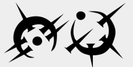
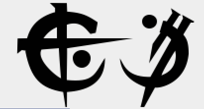
To get started I took the chart of the allomantic symbols from mistborn 1 from Isaac's website and cut out each symbol into a separate bmp file. I then went through each symbol, using the symbol as a background for it's respective letter. I then carefully traced around each one using font forge's point tracing system.
The first few symbols took me a long time and many deleted lines to accomplish, but as I got more experience I was able to trace the symbols faster and with a better quality. I ended up going back and redoing my early tracings as I wasn't satisfied with them. They still aren't perfect, but well enough.
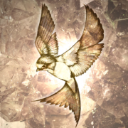
A tracing of duralumin ('s' in the steel alphabet) with the background visible

And the tracing without the background
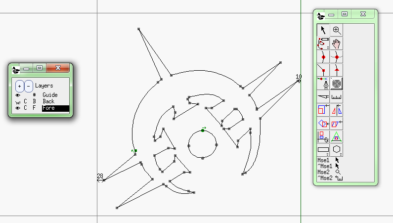
I hit my first major problem with the tracing when I reached the symbols which had enclosed areas, such as copper, gold and bendalloy. My standard method for tracing wouldn't work with these as the enclosed areas would be filled in with black. After some research and experimentation with different tools and methods I managed to create the symbols using the cutting tool. I did the full outline of the symbol, passing through the enclosed section and ignoring the part of the spikes that would close it off. I would then use the cutting tool to cut the appropriate places on the curves into a couple of separate segments, delete the middle section and then link up the cuts to create the beam of the spike, leaving an enclosed section. If that sounds confusing don't worry, it confused me too and I muddled it more than once.
Once I had traced all the symbols to make all the glyphs I needed (the characters in a font are refered to as glyphs) I adjusted the left side bearing and the right side bearing of the glyphs (the space left to either side when a glyph is typed) so that the spacing between the symbols when using the font would be approximately equal. Then came what I have to say was my least favourite part of creating the font, kerning.
Kerning is the process of taking each and every pair of glyphs in the font and adjusting the space between them. This is done so that the glyphs fit well together with no overlapping parts or strangely large gaps. An example of this is if you type a capital 'T' followed by an 'o', the 'o' will actually be positioned slightly under the 'T' so as not to leave a gap. This is easier to see in a larger size so here are To and Th for comparison:
To Th
Kerning turned out to be quite important for the steel alphabet as some of the characters have long spikes jutting out to one side or the other. In some cases, depending on the spacing of the pair, this could leave the spike overlapping with the next symbol, or with a large gap in-between them that looked very strange.
A couple of good examples of where this kerning is useful are the pairs:
sv
cm
Once the kerning was complete there was nothing left to do but to tell font forge to actually create the font and then post it for others to enjoy.
Closing thoughts
I enjoyed making the font and learned a lot about the process of making fonts from doing so. I elected to create it for the steel alphabet as it was during the final empire as I personally like those symbols the best but also because some of the others, notably the symbols in "Hero of Ages" would have been notably harder to do. It certainly isn't a professionally developed font, their are numerous flaws and imperfections with it, but by and large I am happy with the result.
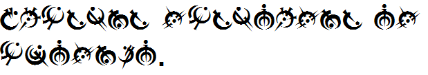
In future posts I will be talking about the projects I am currently working on, I'll leave you with a sentence saying "Brandon Sanderson is awesome." in the font.
Thanks for reading!
A very late edit for anyone who stumbles across this now. You can download the font here: http://steelministry.com/viewtopic.php?f=6&t=501&p=7410#p7410 A site update broke old attachments on that forum at one point, but I've uploaded a new copy of the file.)
1 Comment
Recommended Comments